FEATURES
FEATURE
Future Lost in Type vol.04
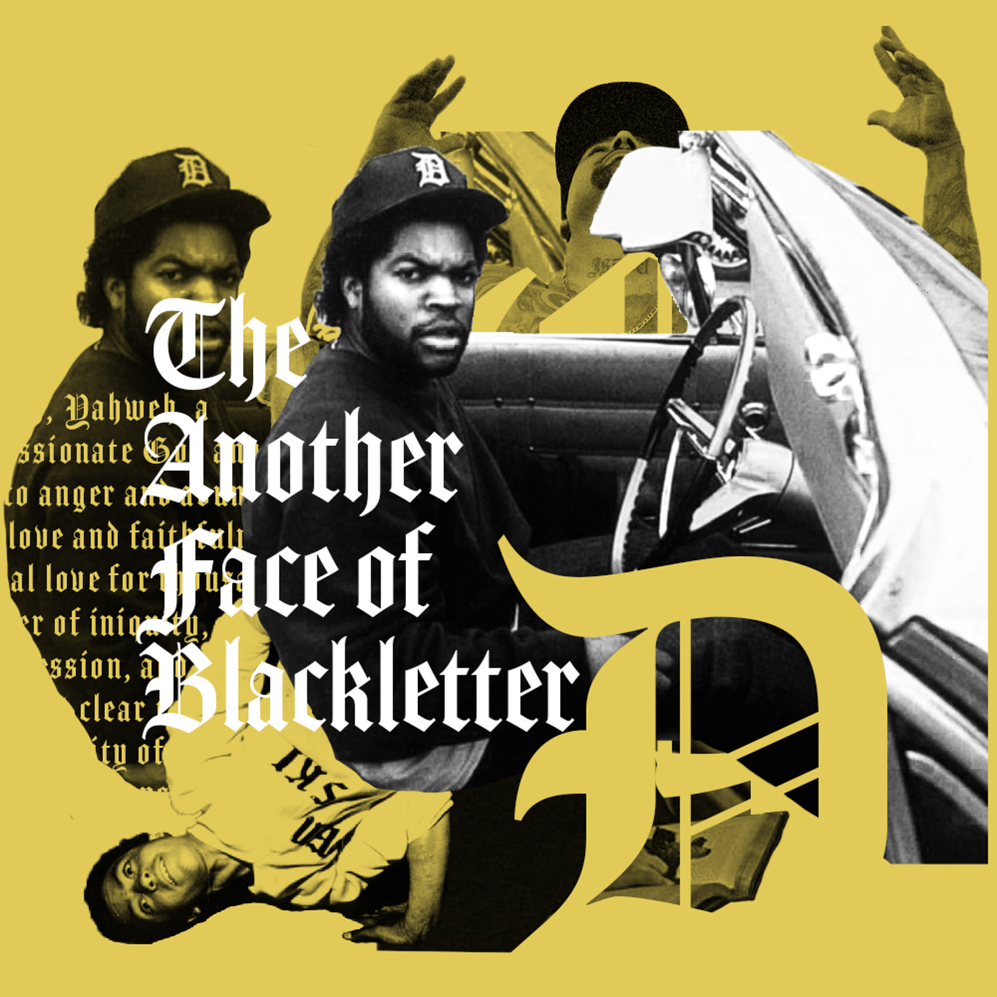
Why is that? The black letters we see in pop culture are next to the bad guys. It's as if we get the impression of cool, boisterous delinquents who are about to get into trouble at any moment. When did this all start? To fill in the gap between the austere impression we get from the Gutenberg Bible and newspaper mastheads, we look back on 100 years of Blackletter, from HIPHOP, ROCK, Satanism to Nazism.
何故かポップカルチャーで見かけるブラックレターは、ワルそうでカッコいい。これはいつ始まったことなんだろう?グーテンベルク聖書やキリスト教会でみる時の厳かな印象とはかけ離れたこのギャップを埋めるべく、HIPHOP、ROCK ,悪魔崇拝からナチスまで、ブラックレターの100年を振り返る。
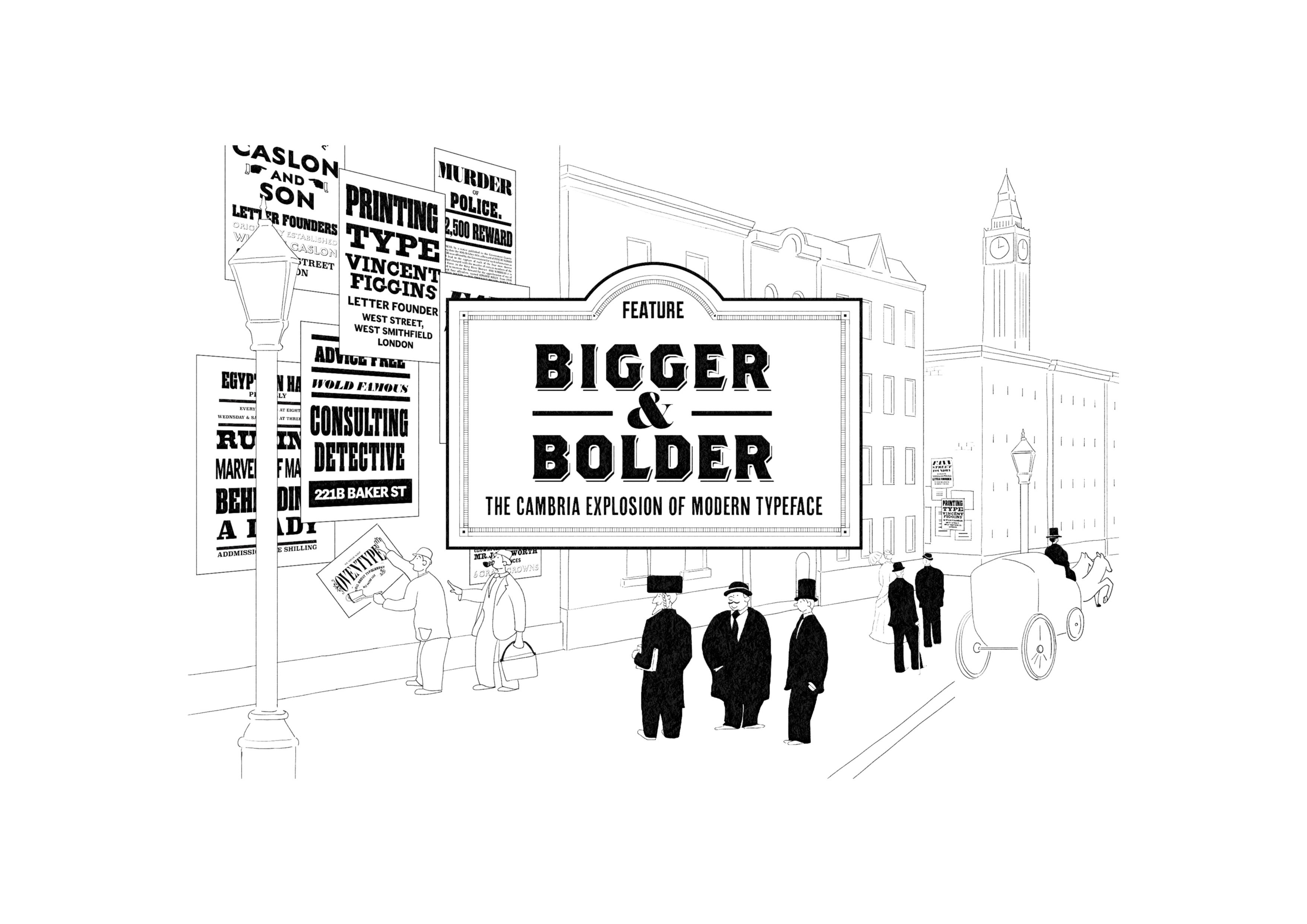
Did the birth of the display typeface revolutionize how letters look? The devices used to make bigger, bolder, "short words" readable have colored the world in rough and sometimes beautiful ways. From fat faces to woodcuts, we now unravel the Cambrian explosion of modern typefaces, born at the dawn of the 19th century and buried in the shadows of history.
ディスプレイタイプの誕生は革命的に文字のカタチを変えてしまった?より大きく、より太く「短い言葉」を読ませるための工夫は、粗々しく、そして時に美しく世界を彩ってきた。ファットフェイスからウッドタイプにいたるまで、19世紀の幕開けとともに誕生し歴史の影に埋もれたモダンタイプフェイスのカンブリア爆発をいま紐解く。
Did the birth of the display typeface revolutionize how letters look? The devices used to make bigger, bolder, "short words" readable have colored the world in rough and sometimes beautiful ways. From fat faces to woodcuts, we now unravel the Cambrian explosion of modern typefaces, born at the dawn of the 19th century and buried in the shadows of history.
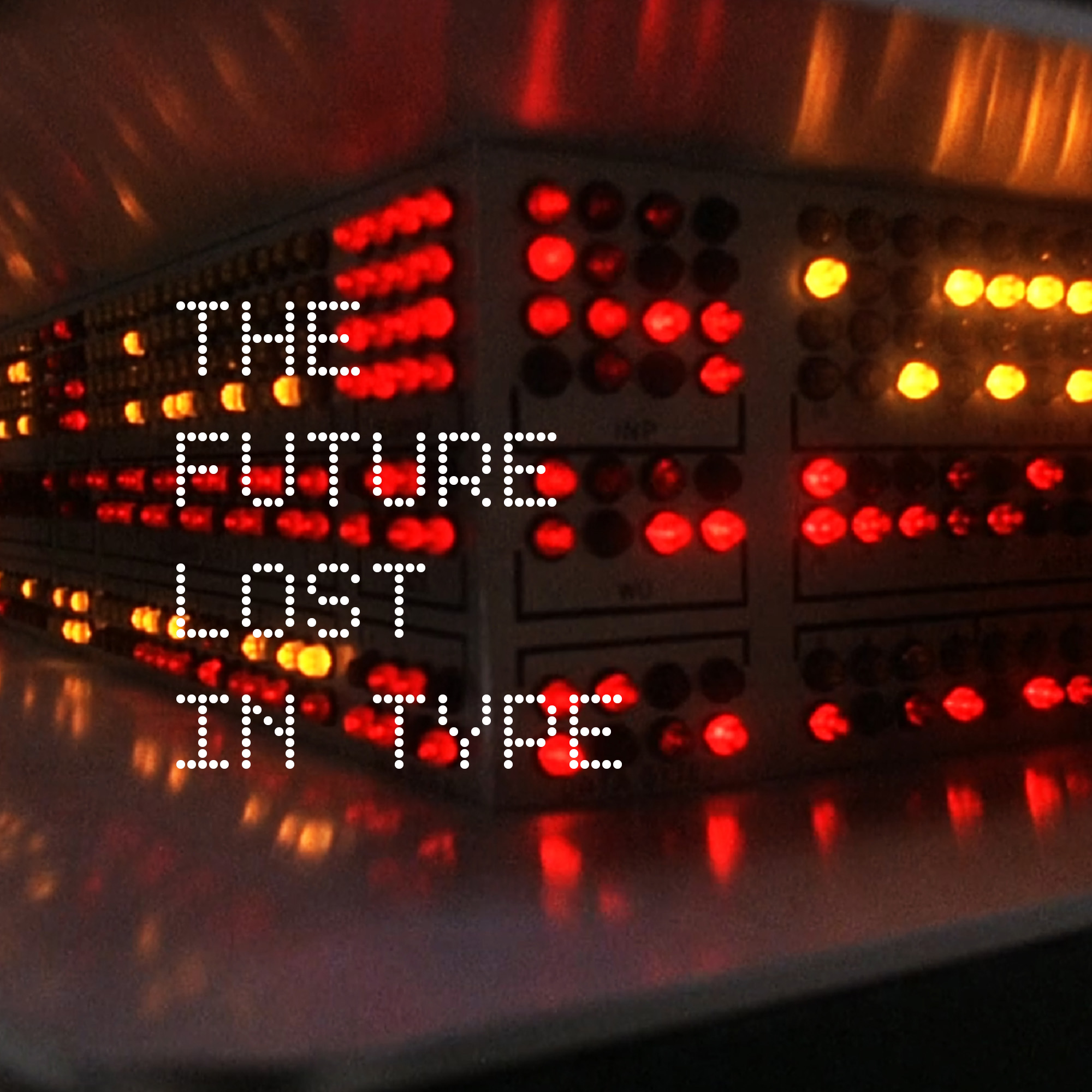
かつての未来は日常になった。サバービアSF映画『WARGAMES』を通して知るエレクトロニクス黎明期をめぐるタイプフェイスの世界。21世紀を夢見た技術者たちが作り出し、ガラパゴスのごとく取り残されたレトロフューチャリスティックな文字たちをいま解体する。
This section explains some of the basics of fonts and typography in a way that even those unfamiliar with design and typography can understand. From the origins of fonts and typography to basic terminology, type classifications, and type designers, this section provides a condensed explanation of the essential knowledge needed to enjoy the world of European typography.
デザインや欧文に不慣れな方でもわかるように欧文のフォントやタイポグラフィーについての基本的な幾つかのことを解説してゆきます。フォントおよびタイポグラフィーの成り立ちについてから、基本的な用語、タイプの分類、タイプデザイナーについてまで、欧文タイポグラフィーの世界を楽しむための必須な知識を凝縮して解説しています。
Oventypeは欧文のタイポグラフィーとフォントについてのウェブサイトです。タイポグラフィーとはフォントや文字組み等グラフィックデザインの中心となる活字の扱いについての総称で、ひたらくいえばデザインの中での『文字』の扱いについてのことです。書籍に関するやや教科書的なタイポグラフィーについては少なめに、書を捨て街へ出たときに心惹かれるようなディスプレイタイプフェイスが使われた、看板やポスター、商品のパッケージからTシャツのロゴや映画のタイトルのようなものを中心に、海外のグラフィックデザインやフォントなどラテンアルファベットでデザインされた作品についてタイプフェイスやその後ろにある欧文の文字文化についての情報を不定期に発信してゆきます。
OVENTYPE is a website about typography and fonts. Typography is a general term for the treatment of type, which is central to graphic design, such as fonts and letterforms, or more simply, the treatment of “letters” in design. This site focuses on graphic design and fonts from overseas, with less emphasis on typography related to textbook books and more on display typefaces that attract people when they leave their books behind and go out on the street, such as billboards, posters, product packaging, T-shirt logos, movie titles, and so on. We will occasionally provide information about typefaces and the European letter culture behind them, focusing on works designed using the Latin alphabet.