
JapanEasy
07/30/2018
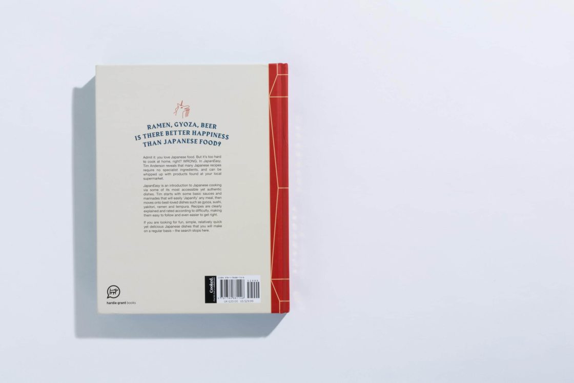
イギリスで出版された日本料理のレシピ本。欧米人の多くは日本食は高級で難しいと考えているため、家庭で作れる簡単な日本食のレシピを優しいイラストと共に紹介した本。使われているフォントはHarbour。ローマン体をブラックレターのタッチでデザインされたヘビーなタイプも日本食を題材とした本のタイトルでは、和文の明朝体のもつ特徴と重なり、文字の文脈とは関係なく不思議とマッチしている。
A Japanese recipe book published in the UK. Since many Westerners consider Japanese food to be expensive and difficult, this book introduces simple Japanese recipes that can be made at home with gentle illustrations. The font used is Harbour, a heavy Roman type designed with a touch of Blackletter, but in the title of a book about Japanese food, it overlaps with the characteristics of the Japanese Mincho type, which strangely matches regardless of the context of the text.
-
Typeface

-
Format
Books -
Industries
Food/Beverage -
Designer
Evi O studio -
Location
United Kingdom -
Publish Date
2017
Typeface
Harbourはブラックレター風のディスプレイ用のセリフタイプフェイスです。Harbour はラテンとゲルマニックのスタイル-文化的に政治的にそして美的に対立する2つのレターフォーム–のぶつかりあいです。ラテンタイプフェイスのレターフォームは幾何学が基本ですがブラックレターはカリグラフィーが基本です。Harbourはペン由来のカリグラフィックな形を生かしつつタイプフェイス自体はペンで書かれた文字というよりも活字として明確に設計されたダイナミックなレターフォームとして制作されています。
Harbour is a clash of Latin and Germanic typestyles - two conflicting letterforms, culturally, politically and aesthetically. Latin letterforms have a geometric base, blackletter types are calligraphic. Harbour takes calligraphic forms that derive from writing with quills, but is a typeface that is clearly drawn‚ rather than written‚ to produce graphic, dynamic letterforms.


