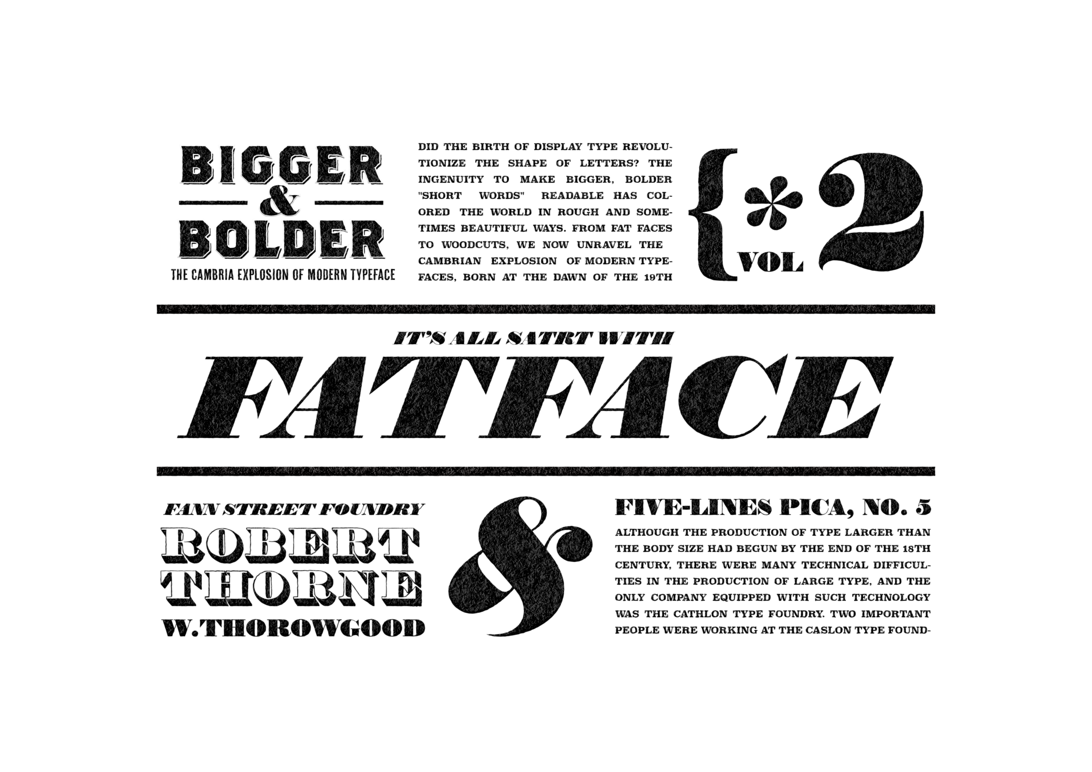
BIGGER&BOLDER VOL.2
The Cambria Explosion of Modern Typeface
ディスプレイタイプの誕生は革命的に文字のカタチを変えてしまった?より大きく、より太く「短い言葉」を読ませるための工夫は、粗々しく、そして時に美しく世界を彩ってきた。ファットフェイスからウッドタイプにいたるまで、19世紀の幕開けとともに誕生し歴史の影に埋もれたモダンタイプフェイスのカンブリア爆発をいま紐解く。
Did the birth of the display typeface revolutionize how letters look? The devices used to make bigger, bolder, “short words” readable have colored the world in rough and sometimes beautiful ways. From fat faces to woodcuts, we now unravel the Cambrian explosion of modern typefaces, born at the dawn of the 19th century and buried in the shadows of history.
It All Started with Fat Face
全てのはじまりはファットフェイス
大きなサイズの活字をつくる技術をもったロンドンの3つのファウンダリーが新たなマーケットの需要に答えようと新しいデザインを提案してゆく。そのすべての始まりはファットフェイスでした。19世紀のはじめポスターというメディアの登場で大きな活字の需要が生まれ、それに相応しい文字デザインの追求がはじまりました。そして最初に誕生したのが『ファットフェイス』でした。文字の線幅を広くすることを文字を太らせるといいますが、「目立たせる」ということを考えた場合、文字を大きく太くして黒味をあげてゆくことは一番に思いつくはずの単純明快な発想です。ファットフェイスはそれを極限まで追求しました。しかし、まぁここまで無邪気に文字を太らせたことで、当時から賛否両論を呼んだようで、マーケットは喜んで歓迎しましたが、のちの批評家からは美的観点からタイプ史の汚点との批評が今ものこります。とはいえ、このファットフェイスを起点としてディスプレイタイプの需要が明確になり、その後につづく、スラブセリフやサンセリフのデザイン、タイプフェイスを「太さ」という観点で区分してゆくボールドやフォントのファミリー化の流れを生むこととなります。それとともにポスターというメディアの可能性を加速させた功績が消費社会や情報化社会の基礎を育み、現代の豊富なビジュアルコミュニケーションの原点となっていおり、まさにモダンタイプフェイスの誕生のグランドゼロとも呼べる存在です。
Three London foundries with the technology to produce large typeface designs responded to the demands of a new market by offering new designs. It all began with Fat Face, which was born in the early 19th century with the appearance of the poster , which created a demand for large type and the pursuit of suitable letter designs. The first of such designs was the “fat face. When thinking of making letters “more noticeable,” the first thing that comes to mind is the simple and clear idea of making the letters larger and thicker to increase the blackness of the letters. Fat Face has taken this to the extreme. The market welcomed it with open arms, but later critics still consider it a blot on the history of typography from an aesthetic point of view. Nevertheless, the fat face was the starting point for the demand for display type, and it gave rise to the slab serif and sans serif designs that followed, as well as the trend toward bold and font families, in which the typeface was divided into sections based on “thickness”. The achievements that accelerated the possibilities of the poster also laid the foundation for the consumer and information societies, and are the starting point for the wealth of visual communication that we enjoy today.
ファトフェイスのデザインDesign of Fatface
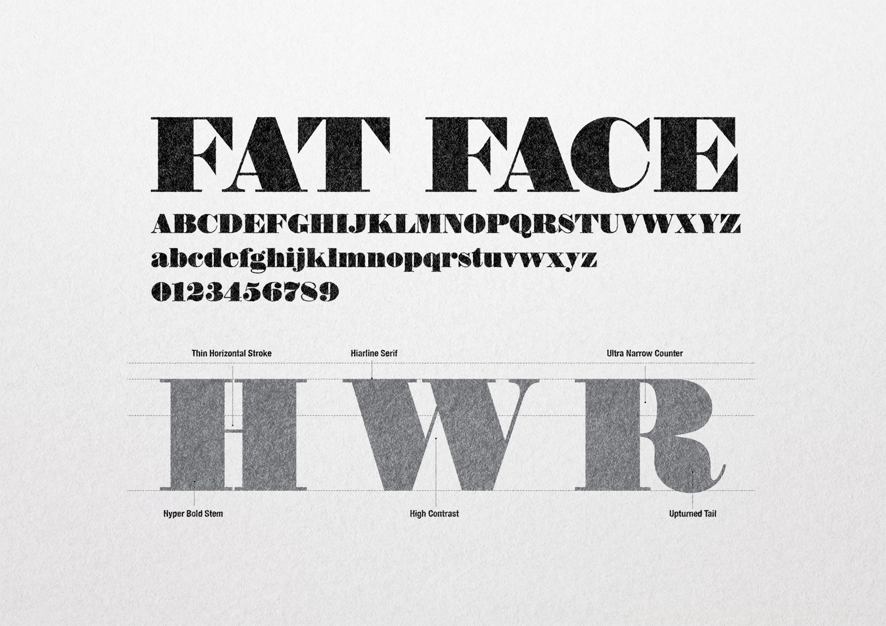
FatFace はDIDOT やBODONIに代表されるモダンローマンのデザインを原型に線を限界まで太らせ強弱のコントラストを極端につけることで黒みを極限まで強くしたデザインが特徴です。セリフ部分はモダンなヘアラインセリフと同様で、多くの場合カウンター部分を極端に狭くすることでより線の黒みがつくられています。真円に近いボールターミナルやユニークな数字のデザインなどが特徴のタイプフェイスデザインのスタイルです。
FATFACE is based on the modern Roman design represented by DIDOT and BODONI, and is characterized by the use of thickened lines and extreme contrasts between the lines and the blackness. The serifs are similar to those of modern hairline serifs, but in many cases, the counter portion is made extremely narrow to create a darker line. The FATFACE design is a typeface design style characterized by near-perfectly circular ball terminals and unique numeral designs.
ファットフェイスの誕生Birth of Fatface
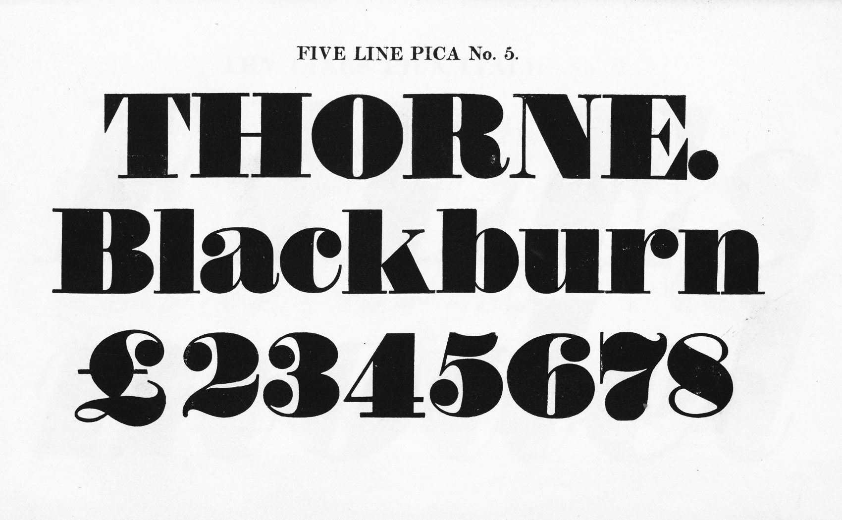
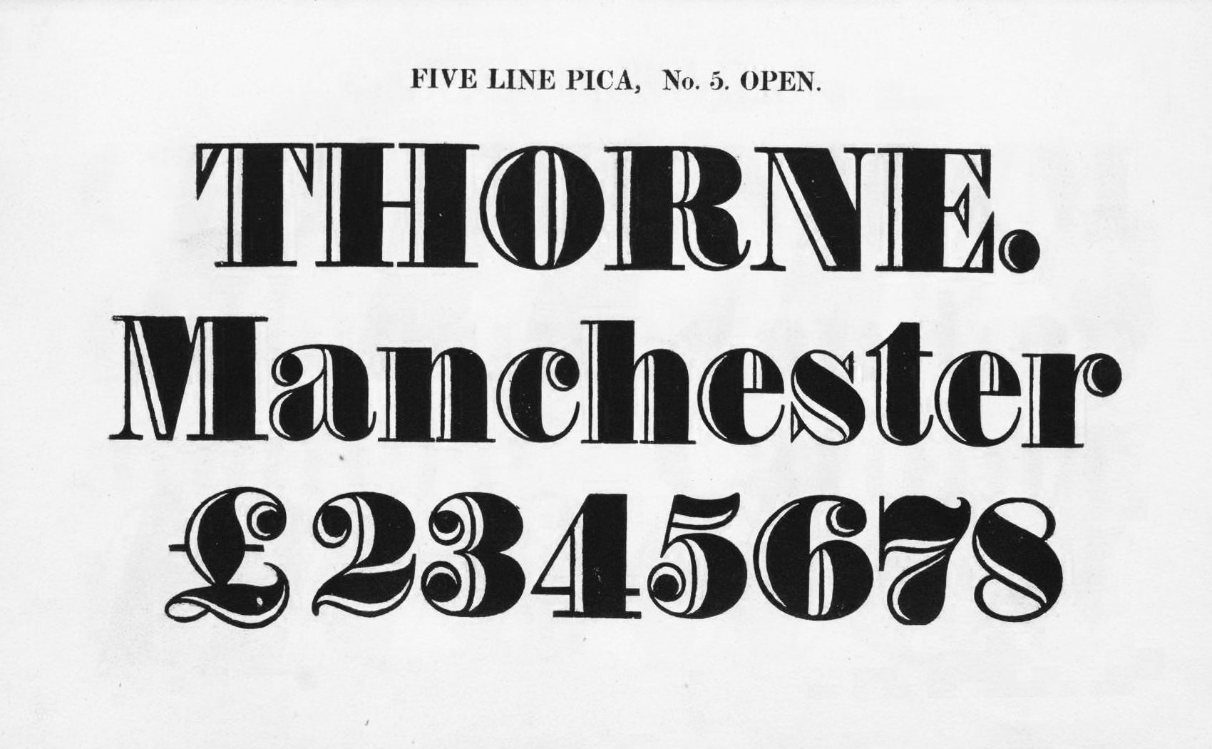
ファットフェイスは19世紀前半に登場し1800年代から1820年代の間にはとても人気がある文字のスタイルとなっていたと言われレタリングや印刷活字においてロンドンを中心に幅広く使われていました。ファットフェイスのデザインの発案者はロバート・ソーン(1753–1820)とされています。1803年ファンストリートファウンダリーが発表したカタログ見本帳(SPECIMEN)に初めてファットフェイスの特徴をもつデザインが掲載されたとされています。現存の確認できるものとしては、ソーンの死後にまだ活字鋳造の経験のなかったソローグッド出版した見本帳カタログの中にソーンのオリジナルタイプフェイスが「Five-lines Pica, No.5」という名前で掲載されています。
Fatface appeared in the first half of the 19th century and became a very popular type between the 1800s and 1820s, and was widely used in lettering and printing type, especially in London. The originator of the fat face design is attributed to Robert Thorne (1753-1820), and it is said that a design with fat face characteristics first appeared in the 1803 SPECIMEN catalog published by the Fann Street Foundry. The first known surviving example of the fat face design is the Thoron’s. The only known surviving copy of Thorn’s original typeface is found in a specimen catalog published after his death by Thorogood, who had no experience in type foundry, under the name “Five-lines Pica, No. 5”.
タイポグラフィーTypograpy
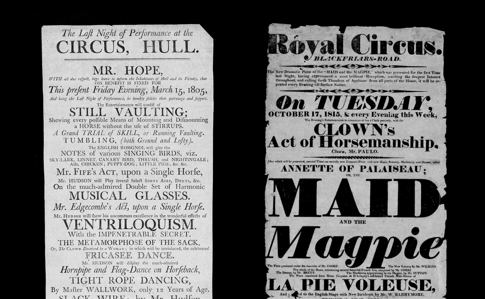
当時に活版印刷で作られたポスターでどのようにファットフェイスが使われていたのか、ファットフェイス以前とファットフェイス以降のデザインの違いを比較してみましょう。ファットフェイス以前のサーカスのプレイビル(チラシ)では、同一の書体でイタリックやオープンで内容に関しての差を表現しています。太さによる違いなどのコントラストは低く書籍の延長上にあるのがわかります。それに対して、ファットフェイス以降のデザインでは、書体によるコントラストがつよまり圧倒的に黒みやインパクトが増していることがわかります。
Let’s compare the differences between pre-fat-face and post-fat-face designs to see how fat-face was used in letterpress posters of the time. Pre-Fat Face circus playbills (flyers) use the same typeface with italics and openings to show differences with respect to content. You can see that the contrast, such as differences in thickness, is low and is an extension of the book. On the other hand, in the post-Fat Face design, the contrast between the typefaces is stronger and the blackness and impact of the typeface is overwhelmingly greater.
ファットフェイスのバリエーションFatface Variation
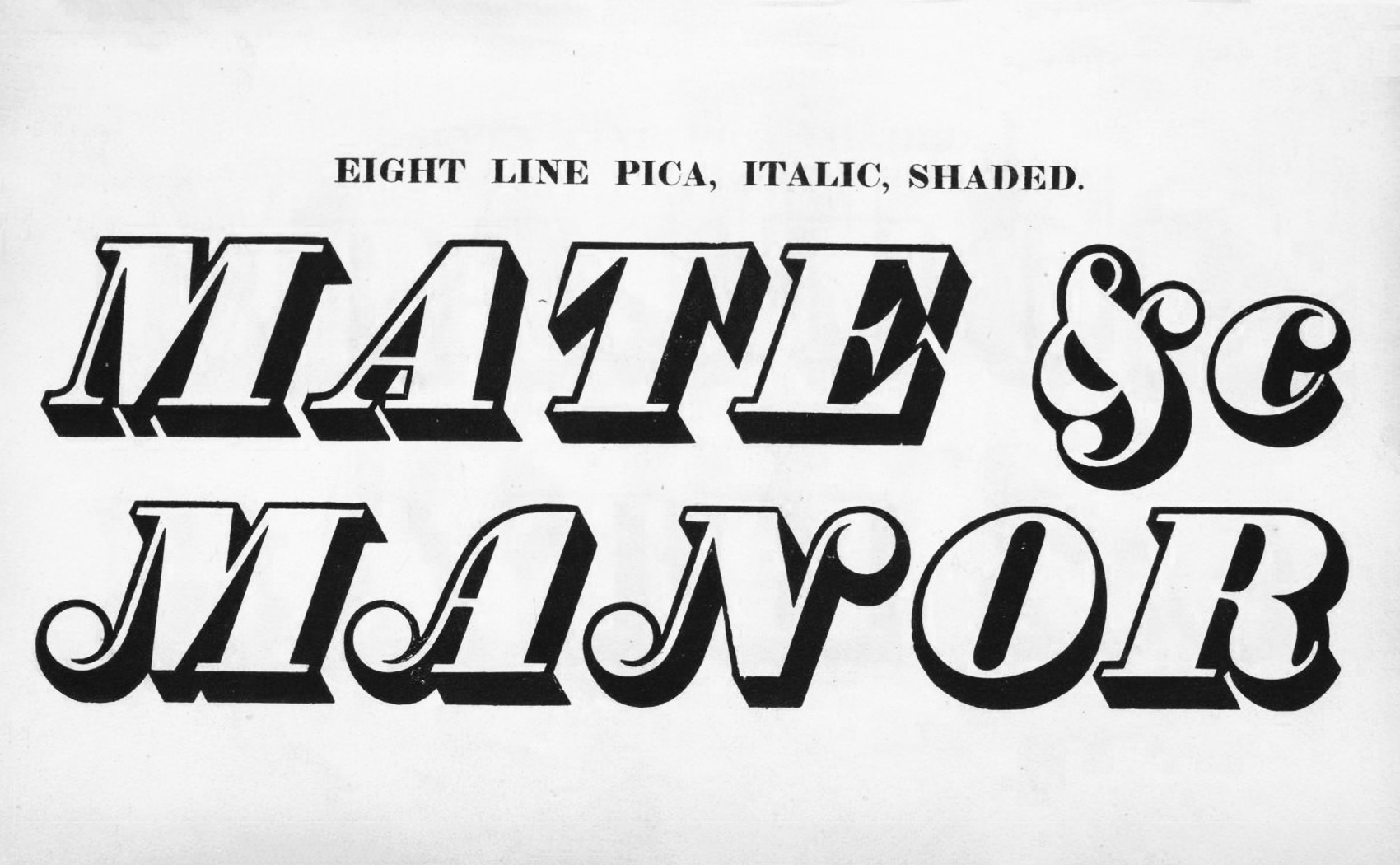
ファットフェイス以前、ローマン体には、サイズの拡大に応じたマイルドな太さの変化以外に線幅の違いはなく、目立たせるためのバリエーションは、イタリック(斜体)とオープン(文字の黒みにインラインを用いた装飾体)などがありました。ファットフェイスでは大きさ、太さによる展開、装飾的なバリエーションは、イタリック、オープンに加え、シェイデッド(影をつけて立体的にしたもの)、バックスランテッドイタリック(逆側に傾斜したもの)などが豊富に加えられています。
Before Fat Face, there were no differences in line width in Roman type other than a mild change in thickness as size increased, and variations to make it stand out included italic and open (decorative with inlines in the black of the letters). In fat faces, development by size and thickness, and decorative variations were added in abundance, such as shaded (three-dimensional with shadows) and back-slanted italic (slanted on the opposite side), in addition to italic and open.

サイズの競争Size Competition
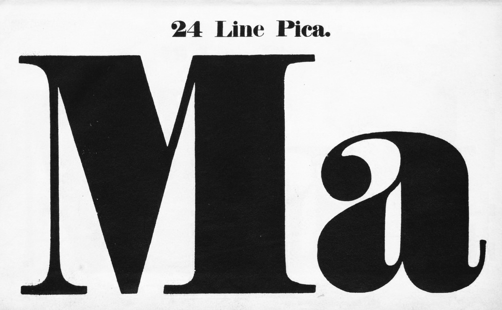
1812年にキャスロン4世がサンスペリアルマトリクスという技法の発明により「大きな活字」の制作が向上しました。フィギンズ、ソーンも同様の技法 「cast in mould and matrixes」を用いることにより、大きな活字を作る生産力が向上し競争に拍車がかかります。タイプをより太くより大きくしてゆくための競争が1820年ごろまでつづきますが、やがて木製での活字の製作が可能となりウッドタイプが台頭してきたことで、金属活字でのサイズ競争は収束します。参考として、ファットフェイス以前のカタログ見本での最大の大きさは6 line Picaで, ポイントで表すと72pt、1インチ、2.5センチほどです。ファットフェイスが人気の頃1830年代の見本では、最大24 Line Pica、ポイントで表すと288pt、4インチ、10センチほどです。
In 1812, Caslon IV improved the production of “large type” with the invention of the sans superior matrix technique. Figgins and Thorn used the same technique, “cast in mold and matrixes,” which increased the productivity of large type and spurred competition. The race to make type thicker and larger continued until around 1820, when it became possible to produce type in wood, and wood type emerged. For reference, the largest size in pre-fat face catalog samples was 6 line Pica, which is 72 pt, or 1 inch, or 2.5 cm in points. The maximum size for a sample from the 1830s, when fatfaces were popular, is 24 line pica, 288 pt, 4 inches, or 10 centimeters in points.
「ファットフェイス」の現在地Where is “fat face” today?
この、より太く大きな活字をつくるファットフェイスの競争からさまざまな流れがうまれ、大きな活字を効率的に生産するためにウッドタイプ(木製の活字)の生産技術や、デザインの派生系としてスラブセリフとサンセリフのデザインは同時期に生み出されたモダンタイプデザインのもっとも重要な出来事となってゆきます。ファットフェイスはまだ使われているのか?答えはイエスです。きっとこのデザインの文字を毎日のように見かけていることと思います。それはお財布の中の紙幣に使われている文字のデザインがその特徴にピッタリとあてはまっているからです。正確には、紙幣は鋳造活字ではなく凹版彫刻によるレタリングなのですが、とくにアメリカ合衆国のドル札のデザイン(それを参考にした日本銀行券の英文)は、19世紀後半に本格的に導入されデザインがなされたことで、ヴィクトリア時代のデザインエレメントが数多く残っています。ドル札では中心的に使われている文字やアラビア数字のデザインにはファットフェイスの影響による特徴が色濃くのこっています。産業革命と資本主義が現代社会の原点であることと、紙幣というその中心を担う印刷物にこのファットフェイスが使われていることに、太さや視認性もさることながら、原点としてはじまりとしてのシンボリックな意味合いを感じとることができることと思います。最後に、当時のオリジナルデザインのフォントを元に様々な形でリバイバル・デジタイズされていますので、その一部を紹介します。
The competition to produce larger, thicker type led to the development of various trends, including wood type production technology for efficient production of larger type, and slab serif and sans serif designs as derivatives of the most important events in modern type design that occurred at the same time. Finally, are fat faces still in use? The answer is yes. You probably see letters of this design every day. This is because the design of the letters used on the bills in your wallet fits its characteristics perfectly. To be precise, the lettering on paper money is intaglio engraved rather than cast type, but the design of the U.S. dollar bill in particular (and the English text of the Bank of Japan note, which was based on it) was introduced and designed in earnest in the late 19th century, and many design elements from the Victorian era remain. The design of the letters and Arabic numerals, which are central to the dollar bill, are strongly characterized by the influence of the fat face. The Industrial Revolution and capitalism are the starting point of modern society, and the fact that the fat face is used on a bill, the printed matter that plays a central role in modern society, is symbolic of its starting point, not to mention its thickness and legibility.Finally, the font has been revived and digitized in various forms based on the original design of the time, some of which are introduced below.
-
THROWGOOD
ソーンのオリジナルデザインとスローグッドがのちにデザインしたイタリックが 1953年にリバイバルされそのデザインがTHROWGOOD という名前でデジタルフォントとなっています。
Thorn’s original design and Throwgood’s later italic design were revived in 1953 and became a digital font under the name
https://www.myfonts.com/collections/thorowgood-font-linotype?rfsn=6624885.fabfd2c
-
THRONESHADED
同じくStephenson Blakebのリバイバルから、シェードバージョンが、THORNE SHADEDという名前でデジタルフォントとなっています。
A shaded version, also from Stephenson Blakeb’s revival, is a digital font under the name THORNE SHADED.
http://moorstation.org/typoasis/designers/steffmann/samples/t/thorne.htm
-
Isambard
Commercial Typeが、Caslonをはじめとして3つのファウンダリのファットフェイスを徹底的に研究してつくられたデジタルフォント。
A digital font created by Commercial Type after extensive research of three foundries’ fat faces, including Caslon.
https://commercialclassics.com/catalogue/isambard/isambard