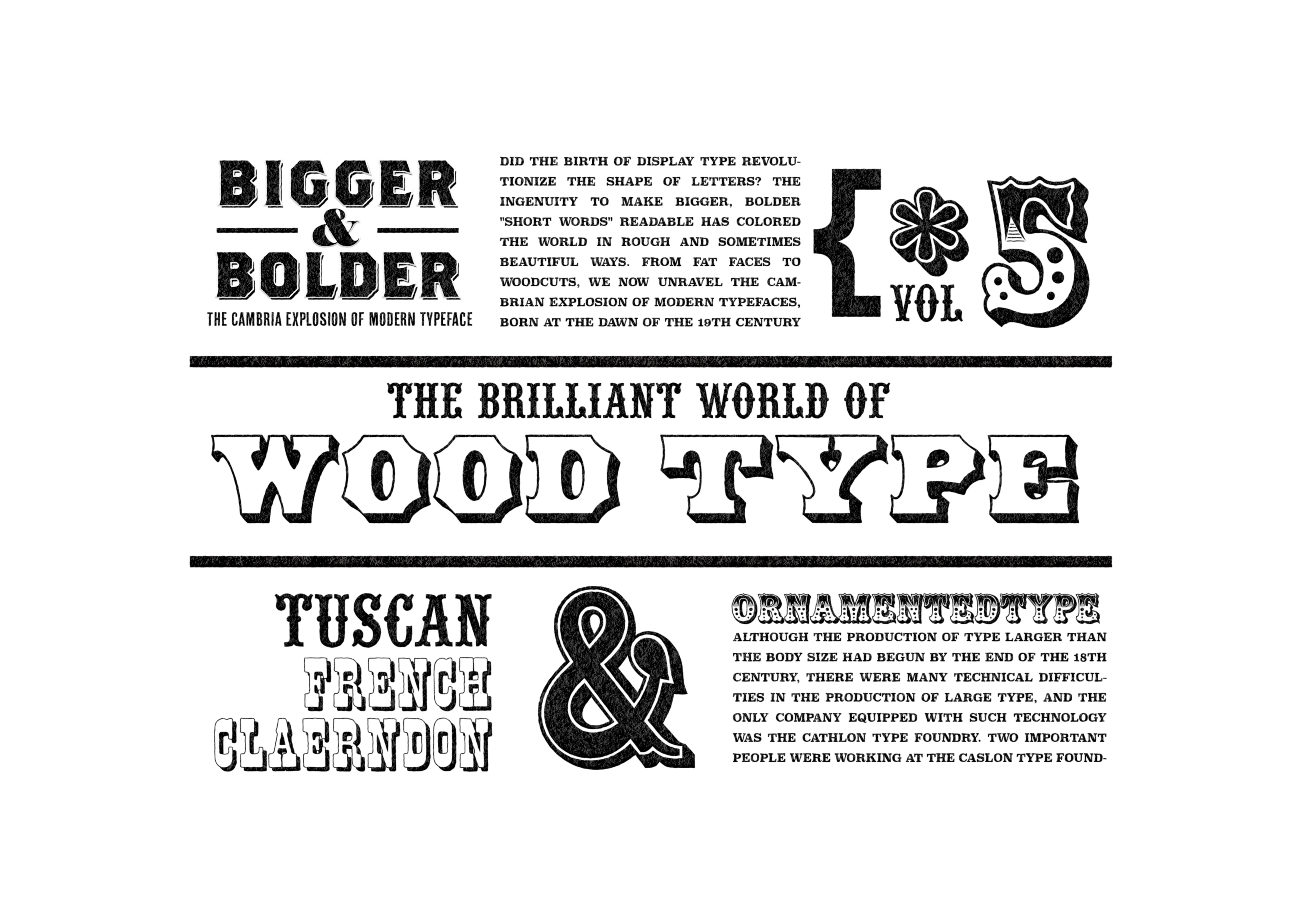
BIGGER&BOLDER VOL.5
The Cambria Explosion of Modern Typeface
ディスプレイタイプの誕生は革命的に文字のカタチを変えてしまった?より大きく、より太く「短い言葉」を読ませるための工夫は、粗々しく、そして時に美しく世界を彩ってきた。ファットフェイスからウッドタイプにいたるまで、19世紀の幕開けとともに誕生し歴史の影に埋もれたモダンタイプフェイスのカンブリア爆発をいま紐解く。
Did the birth of the display typeface revolutionize how letters look? The devices used to make bigger, bolder, “short words” readable have colored the world in rough and sometimes beautiful ways. From fat faces to woodcuts, we now unravel the Cambrian explosion of modern typefaces, born at the dawn of the 19th century and buried in the shadows of history.
THE BRILLIANT WORLD OF WOODTYPE
ウッドタイプの華麗なる世界
「短い言葉」を読ませるためにディスプレイタイプがより太くより単純化して「黒み」を追求するファットフェイスやスラブセリフの方向性へ進むのと平行して、活字の形にさらに視覚的な要素を追加して文字をいかに「目立たせる」かを追求する「装飾」の可能性を探る方向性が存在していました。 もともと文字を装飾することは、古くは聖書の写本のイニシャルといわれる装飾頭文字のカリグラフィーにおけるテクニックや、近代においてもレタリングやサインペインティングなどで育まれてきた文化があり、それがディスプレイタイプの黎明期に活字に取り入れられることとなりました。おりしも産業革命後のヴィクトリア朝時代は、バロックやロココなどの前時代の貴族的な装飾が、機械化による大量生産技術の開発に伴って安価に行き渡る大衆化がおきていて、デザイン史の中でも装飾の特異点と考えられています。そんな猫も杓子も装飾マシマシなモダンデザイン前夜に起きた、活字の装飾について少しのぞいてみたいと思います。
In parallel with the trend toward fat faces and slab serifs, which pursue “blackness” by making display type thicker and simpler in order to make “short words” readable, there was a trend toward exploring the possibilities of “decoration,” which seeks how to make letters “stand out” by adding more visual elements to the typeface form. Originally, the use of decorative letterforms was a technique in calligraphy, where initials in biblical manuscripts were used to decorate letters, and in modern times, lettering and sign painting have been used to decorate letters. This culture was incorporated into type at the dawn of display type.In the Victorian era after the Industrial Revolution, the aristocratic decorations of the Baroque and Rococo periods were being popularized at low cost with the development of mass production technology through mechanization, and this period is considered a singular point in the history of design. Let us take a look at the decoration of type on the eve of the modern design era, when all the cats and dogs were decorated.
ウッドタイプの誕生The Birth of Wood Type
19世紀までヨーロッパでは活字を作るためには金属鋳造が基本でした。金属活字は一度元となる父型(パンチ)に文字の形を彫刻し、それを母型(マトリクス)に打ち付けて鋳型をつくります。鋳型をつかって鋳造によって複製をしてゆくことで大量に同一の文字を制作することが可能です。それに対して、木製の活字は手作業によって一つづつ複製を強いられるため量産ができず実際的ではないと考えられてきました。時は産業革命の真っ只中、動力を生かした発明に頭をひねる人々がしのぎを削る中、1827年にダリウス・ウェルズが木工機械である「ルータ」を発明したことで状況は一変することになります。ルータは動力を得て木を削ることや磨くことが可能で、この機械化により木製の活字を制作する時間が大幅に短縮し大量生産が可能となりました。そして、1834年に「パントグラフ」が発明されルータとの組み合わせにより手元の作業を正確に拡大複製することが可能となったことで、ウッドブロックをつかった「大きな活字」を制作する条件が整います。ファットフェイスが切り開いたポスター向けのディスプレイタイプの「大きな活字」の需要は右肩上がりに増えているなか、大量生産が可能となった木製の活字は金属活字に対して10分の1程度の価格で提供することが可能でウッドタイプがディスプレイタイプのマーケットへと進出します。さらにダビングやプロトタイピングなど、木製から金属への複製技術の発展もウッドタイプによる装飾などディスプレイタイプのデザインを豊富なものにしてゆきました。
Until the 19th century, metal casting was the basic method of making type in Europe. The metal type was made by engraving the letterforms on a punch, which was then struck into a matrix to make a mold. By using the mold to make reproductions through casting, it is possible to produce identical letters in large quantities. Wooden type, on the other hand, was considered impractical because it could not be mass-produced because it had to be reproduced one by one by hand.In the midst of the Industrial Revolution, when many people were busy trying to come up with new ideas using power, the situation changed when Darius Wells invented the “router,” a woodworking machine, in 1827. The router was powered to sharpen and polish wood, and this mechanization greatly shortened the time required to produce wooden type and enabled mass production. The invention of the “pantograph” in 1834, combined with the router, made it possible to accurately enlarge and reproduce the work at hand, thus creating the conditions for the production of “large type” using wood blocks. The demand for large display type for posters, which Fat Face had pioneered, was steadily increasing, and wood type, which could now be mass-produced at one-tenth the price of metal type, entered the display type market. Wood type entered the display type market. The development of wood-to-metal reproduction techniques, such as dubbing and prototyping, also contributed to the proliferation of display type designs, such as wood type decorations.

ウッドタイプのデザインWoodtype design
産業革命を果たした19世紀のロンドンから、20世紀の中心になる新天地アメリカへと産業や文化が大きく動くとともに、文化の中心をささえる文字もまた求めに応じてカタチを変えてきました。特にウッドタイプの需要が急増した1860年から1890年代のアメリカは西部開拓時代にあたり、開拓の歴史とともにアメリカの文化の根底にウッドタイプが深く刻みこまれてゆくこととなります。ウッドタイプをタイプフェイスデザインの面からみた時、代表的なデザインスタイルには「トスカン」と「フレンチクラレンドン」を挙げることができます。トスカンもクラレンドンもデザイン自体はもともと19世紀のロンドンからやってきました。そう、フィギンズやファンストリートのデザインです。それらが、アメリカで独自の発展を遂げ、いまでは「トスカン・クラレンドン=ウッドタイプ=古き良きアメリカ」のような連想が成立するほど、アメリカ文化と密接なデザインとなっています。ウェスタン映画やベースボールチームに至るまでアメリカ文化には必ずといっていいほどウッドタイプ由来のエレメントが用いられています。
As industry and culture moved from London in the 19th century, the center of the Industrial Revolution, to the United States, the new center of the 20th century, the letters that supported the center of culture also changed form to meet the needs of the times.The 1860s to 1890s, when demand for wood type rapidly increased, was the era of the western frontier, and wood type was deeply engraved in the foundation of American culture as well as the history of the frontier.From the standpoint of type face design, Tuscan and French Clarendon are representative of wood type. Both Tuscan and Clarendon designs themselves originally came from 19th century London. Yes, they are Figgins and Fann Street designs. They have developed in their own way in the United States and are now so closely connected to American culture that the association “Toscan/Clarendon = wood type = good old America” is now established. Elements of the wood type are used in American culture, from western movies to baseball teams.
トスカンTUSCAN
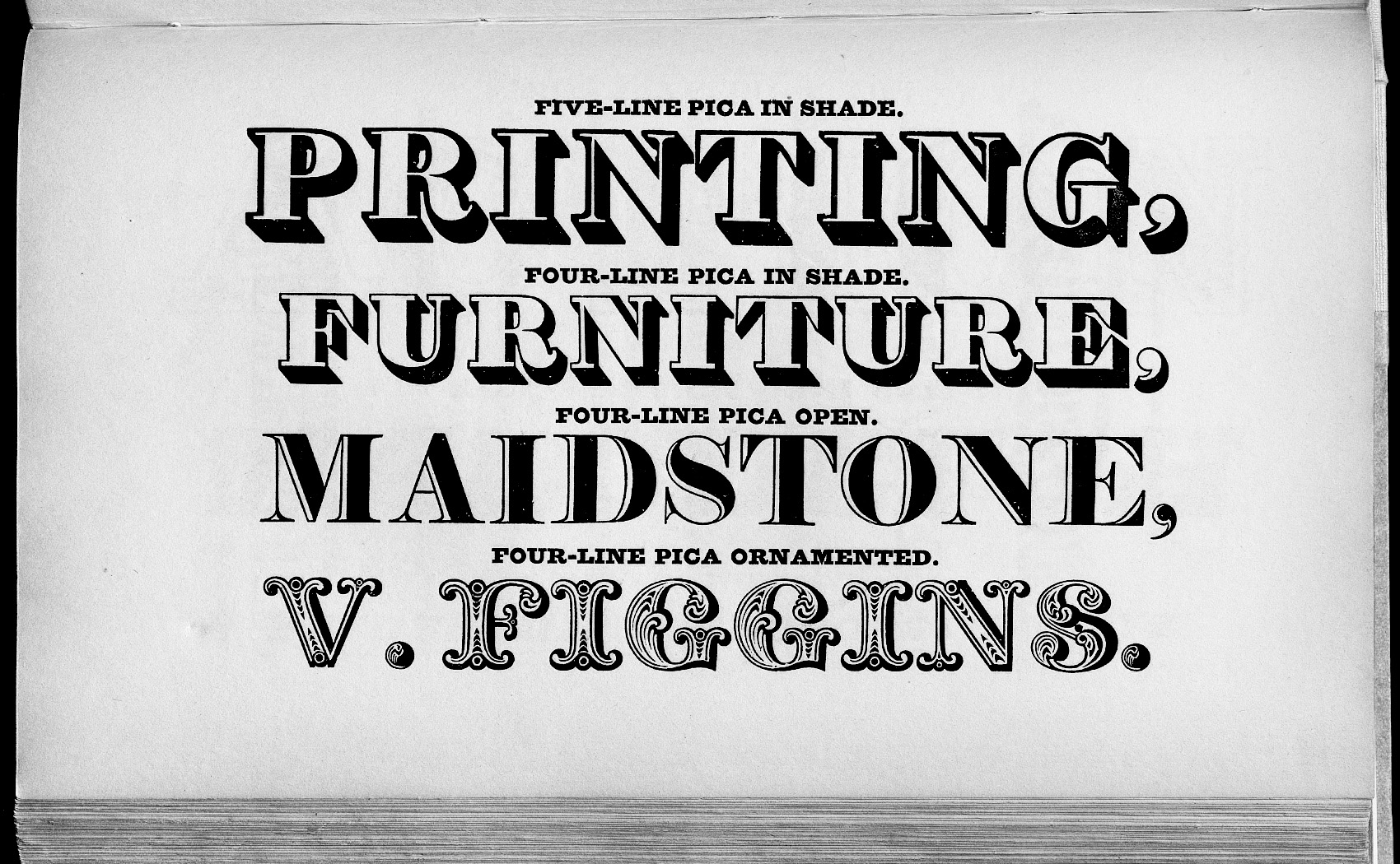
トスカンは特徴的な装飾されたセリフやエレメントを持つものを分類する用語として用いられています。シェイプの特徴では、セリフが二つや三つに枝分かれしたものや、ステムなどの直線部分を絞るような曲線となっていたり、ベースラインとアセンダーラインの中央あたりに装飾的な特徴を持つものをさします。ウッドタイプで好んで用いられたことからウッドタイプと同義的に分類されている場合もあります。ヴィンセント・フィギンズの1801/1815年のカタログに掲載された、FOUR LINE PICA ORNAMENTEDが欧文活字での最初のトスカンであり、ローマンをベースにした文字形で、過度に曲線的で装飾的なセリフと、文字内部へ彫刻のような装飾を施した特徴的なデザインです。
Tuscan is a term used to classify those with distinctive decorated serifs or elements. In terms of shape characteristics, it refers to serifs with two or three branches, curved lines that narrow the stem and other straight parts, and decorative features around the center of the base line and ascender line. Since it is often used in wood types, it is sometimes classified synonymously with wood typesFOUR LINE PICA ORNAMENTED from Vincent Figgins’ 1801/1815 catalog is an early Toscan in European type, a Roman-based letterform with overly curved and decorative serifs and a distinctive design with engraved ornamentation inside the letters. .

アメリカとウッドタイプWood type in US
ウッドタイプはヨーロッパから海を渡った新天地アメリカでさらに独自の発展を遂げてゆくこととります。アメリカ国内で最初にウッドタイプとしてトスカンが登場したのが、Edwin Allen のものが1838年のEdwin Allen 「First Premium Wood types , cut by machinely」に掲載されています。19世紀のアメリカでは機械化した木工によりウッドタイプのファウンダリが成功をおさめ、さまざまなウッドタイプが生まれました。
The wood type was to further develop in its own unique way in the United States, a new country that had crossed the ocean from Europe.The first wood type Tuscan to appear in the U.S. was made by Edwin Allen in 1838 in his “First Premium Wood types , cut by machinely. The success of the wood type foundry led to the creation of a wide variety of wood types.
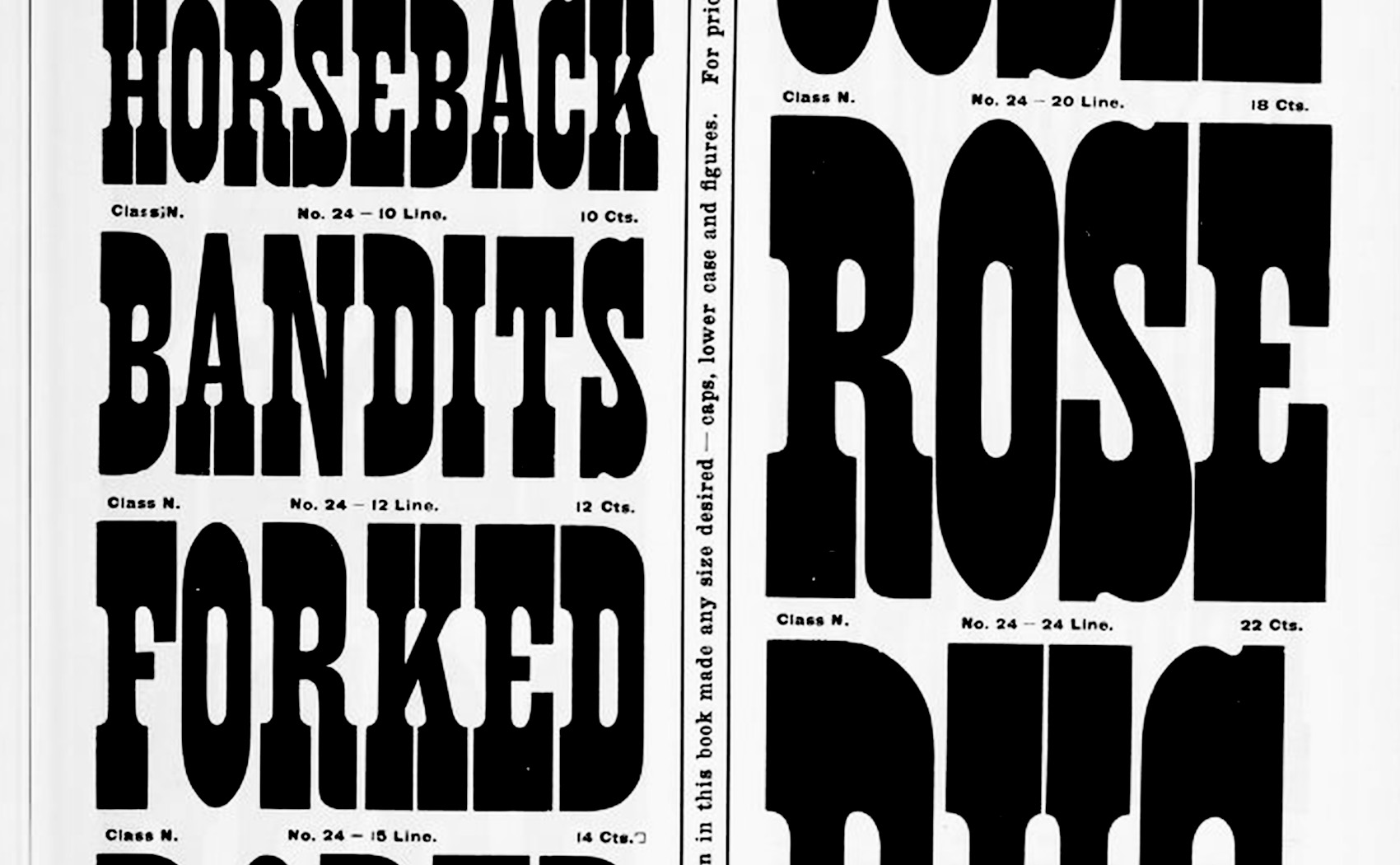
アンティークトスカンANTIQUE TUSCAN
1850年から1860年にかけてつくられた、スラブセリフを原型に縦線を絞るように曲線でカットしたアンティークトスカンと呼ばれるデザイン。
The design called an antique toscan, was made between 1850 and 1860 and is based on a slab serif, cut with a curved line that narrows the vertical line.

フレンチクレランドンFRENCH CLARENDON
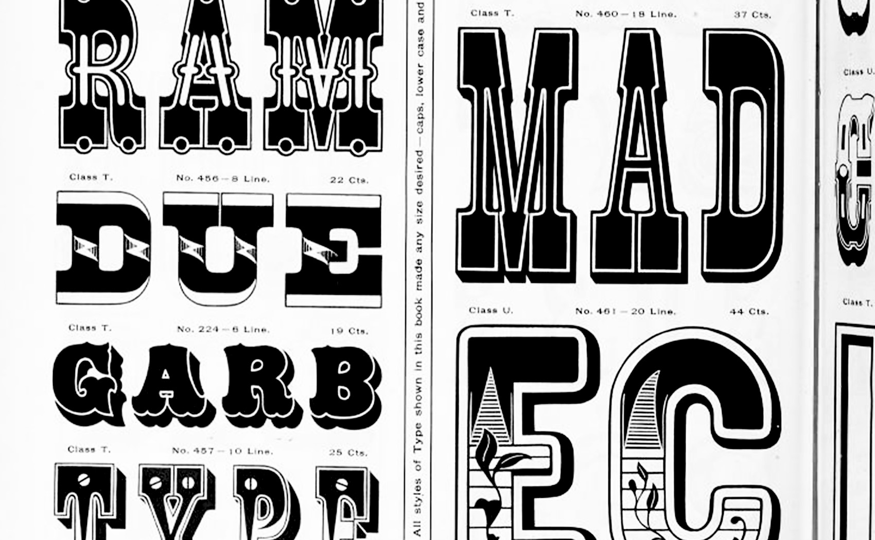
フレンチクラレンドンは、縦線と横線の太さのコントラストが典型的なものとは逆にになったリバースコントラストが特徴のデザイン。同時代にはリーバースコントラストのイタリアンと呼ばれるタイプデザインがあり、スラブセリフなどとともに太いセリフに特徴を持たせることでユニークさを強調している。19世紀のアメリカで好んで用いられたことで、現代でも西部開拓時代を演出する際に、指名手配のビラのWANTEDや、西部劇やテーマパークなどの看板などでしばしばつかわれています。
French ClarendonFrench Clarendon is a design characterized by reverse contrast, in which the contrast between the thickness of the vertical and horizontal lines is reversed from the typical one. The type design of the same period, called Italian with leavers contrast, emphasizes the uniqueness of the thick serifs by making them distinctive, along with slab serifs, etc. A favorite in 19th century America, it is still used today in Westerns, such as WANTED on wanted flyers, and on signs in Westerns and theme parks.
ウッドタイプの装飾Wood Type Decoration
文字自体のフォームのデザインよりも、装飾性という部分でウッドタイプは鋳造活字では不可能だった細やかな装飾を可能にしました。加工の容易な木版はイラストレーションに向いており、もともと凸版印刷において、金属活字と木版のイラストレーションという組み合わせで行われていたものが、ウッドタイプの登場で、文字にイラストレーティブな装飾を施したものや木版画の手法を持ち込んだ表現が数多く登場しました。その中でも装飾の完成度の高かった、ルイ・ジョン・プーシェ Louis John Pouchée のアルファベットと、多色印刷が可能なWilliam Hamilton Pageのクロマティックウッドタイプを紹介します。
More than the design of the form of the letter itself, wood type enables detailed decoration that was not possible with cast type. Woodblock, which is easy to process, is suitable for illustration. Originally, the combination of metal type and woodblock illustration was used in letterpress printing, but with the advent of woodtype, many illustrative decorations were added to the letters and woodcut techniques were brought into the process. The wood type was a combination of type and woodblock illustration.This section introduces Louis John Pouchée’s alphabets, which were highly decorated, and William Hamilton Page’s chromatic wood types, which could be printed in multiple colors.
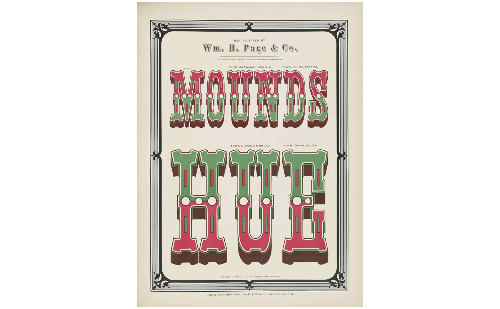
W・HページのクロマティックWillam Hamilton Page
19世紀のアメリカでウッドタイプのデザインの主要人物でクロマティックウッドタイプを開発して大成功しました。クロマティティックタイプとは多色刷りを可能にするウッドタイプで、重ね刷りするために色数にセパレートしたデザインをもつ活字です。
Willam Hamilton Page was a major figure in 19th-century American wood type design and a highly successful developer of chromatic wood type. Chromatic type is a wood type that allows multi-color printing and has a design that separates the number of colors for overprinting.


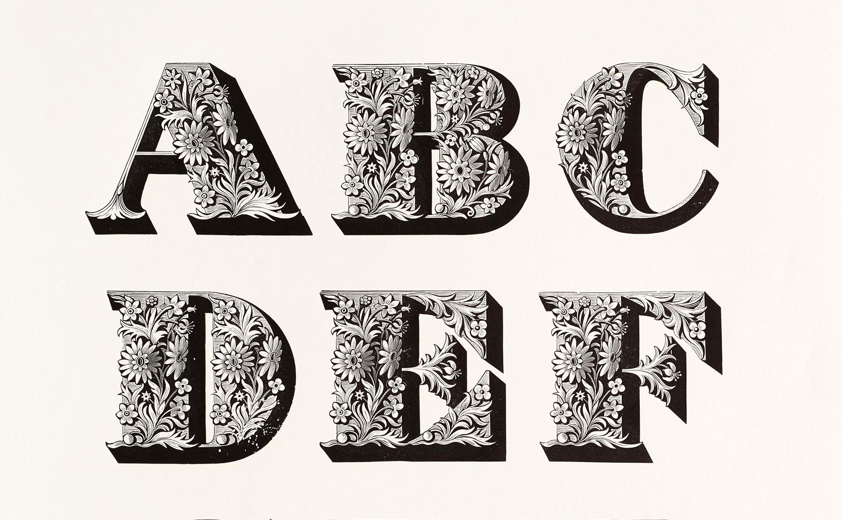
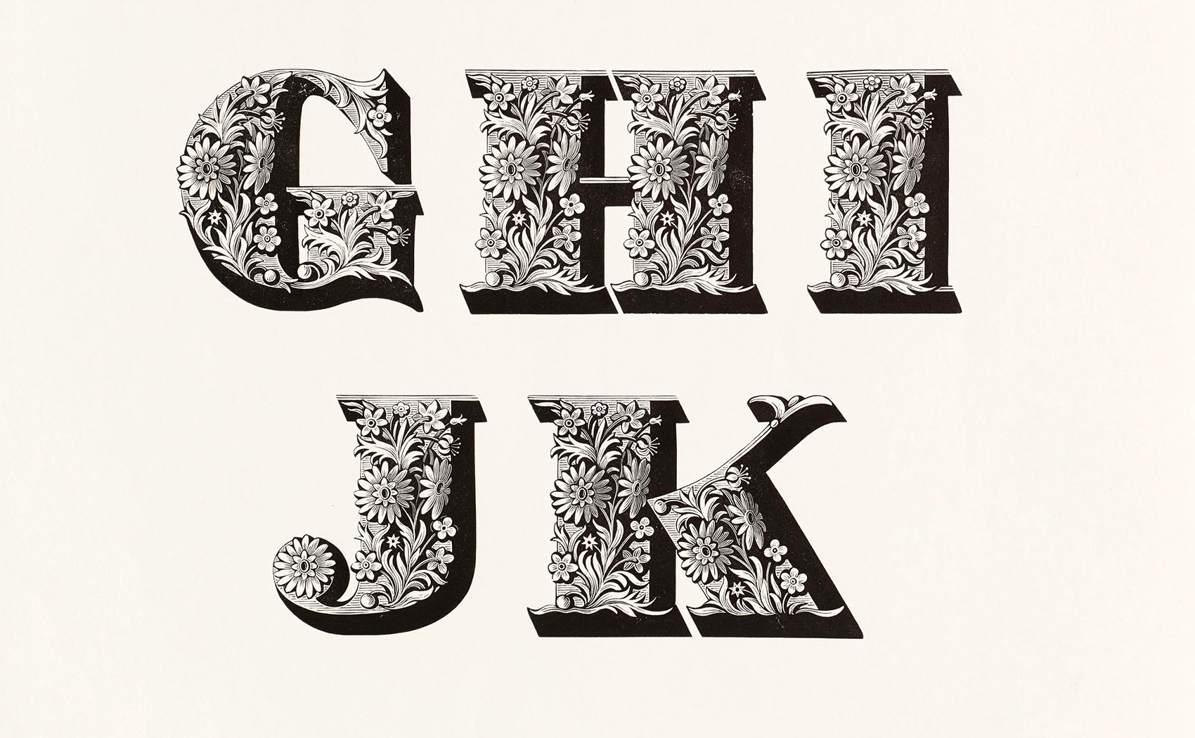
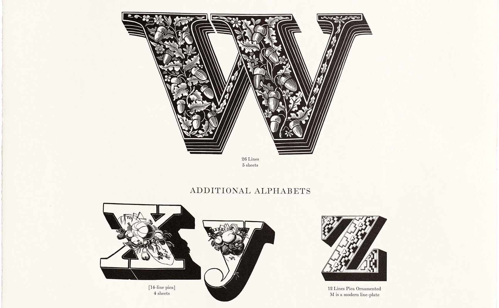
ルイ・ジョン・プーシェの装飾Louis John Pouchée
もっとも美しいとされているウッドタイプとして名高いルイ・ジョン・プーシェ Louis John Pouchée のアルファベット。1820年代に手彫りされた活字としてはもっとも豪華な装飾が施されたものです。レターフォームはソーンのファットフェイスをベースにしていますが、技巧に富んだ豪華な装飾が施されており目を見張るものがあります。写真はロンドンのセント・ブライド・プリンティング・ライブラリー所蔵のもの。
Louis John Pouchée alphabet, considered one of the most beautiful wood types, is the most ornately decorated hand-engraved type of the 1820s. The letterforms are based on the Thorne fat face, but are spectacularly decorated with skillful and lavish ornamentation. The photograph is from the collection of the St. Bride’s Printing Library, London.


ウッドタイプの現在Woodtype today
現在では、活版印刷と同様に大規模に使われることは無くなりましたが、独自のカスレによる温かみや豊富な装飾は近年の再評価も入り今も人々を惹きつけています。木製で相当数が製作されていたため現存しているものも多く、アメリカ国内ではアンティークのインテリア雑貨などを扱う店で見かけることもあります。さまざまなフォントがデジタイズされており、ウッドタイプのタイプフェイスデザインをデジタルフォントで利用することができます。とくに2012年に設立されたHWT(Hamilton WoodType Collection )ではウッドタイプの特徴的でクラシックなものが数多くリバイバル・デジタイズされています。
Today, as with letterpress, it is no longer used on a large scale, but the warmth of its unique cusps and abundant decoration have been reevaluated in recent years and still attract people today. Many of them are still in existence, and can be found in antique stores selling interior goods in the United States.Various fonts have been digitized, and wood typeface designs can be used in digital fonts. In particular, the Hamilton WoodType Collection (HWT), established in 2012, has revived and digitized many characteristic and classic wood type designs.
デジタルフォント
-
Rosewood
1874年のウィリアム・ペイジのクロマティックウッドタイプをモデルに作られた
Modeled after William Page’s chromatic wood type of 1874
https://www.myfonts.com/collections/rosewood-font-adobe?rfsn=6624885.fabfd2c
-
Zebrawood
1854年のウェルズ・アンド・ウェッブ活字会社の見本カタログを元にしたアンティークトスカン
Antique Tuscan based on an 1854 Wells and Webb Type Company sample catalog

-
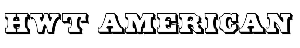
HWT AMERICAN
1874年のウィリアム・ペイジのクロマティックウッドタイプをモデルに作られた
Modeled after William Page’s chromatic wood type of 1874
-
French Clarendon
ウィリアム・ペイジのウッドタイプをもとにしたフレンチクレランドン
French Clelandon based on William Page’s wood type.