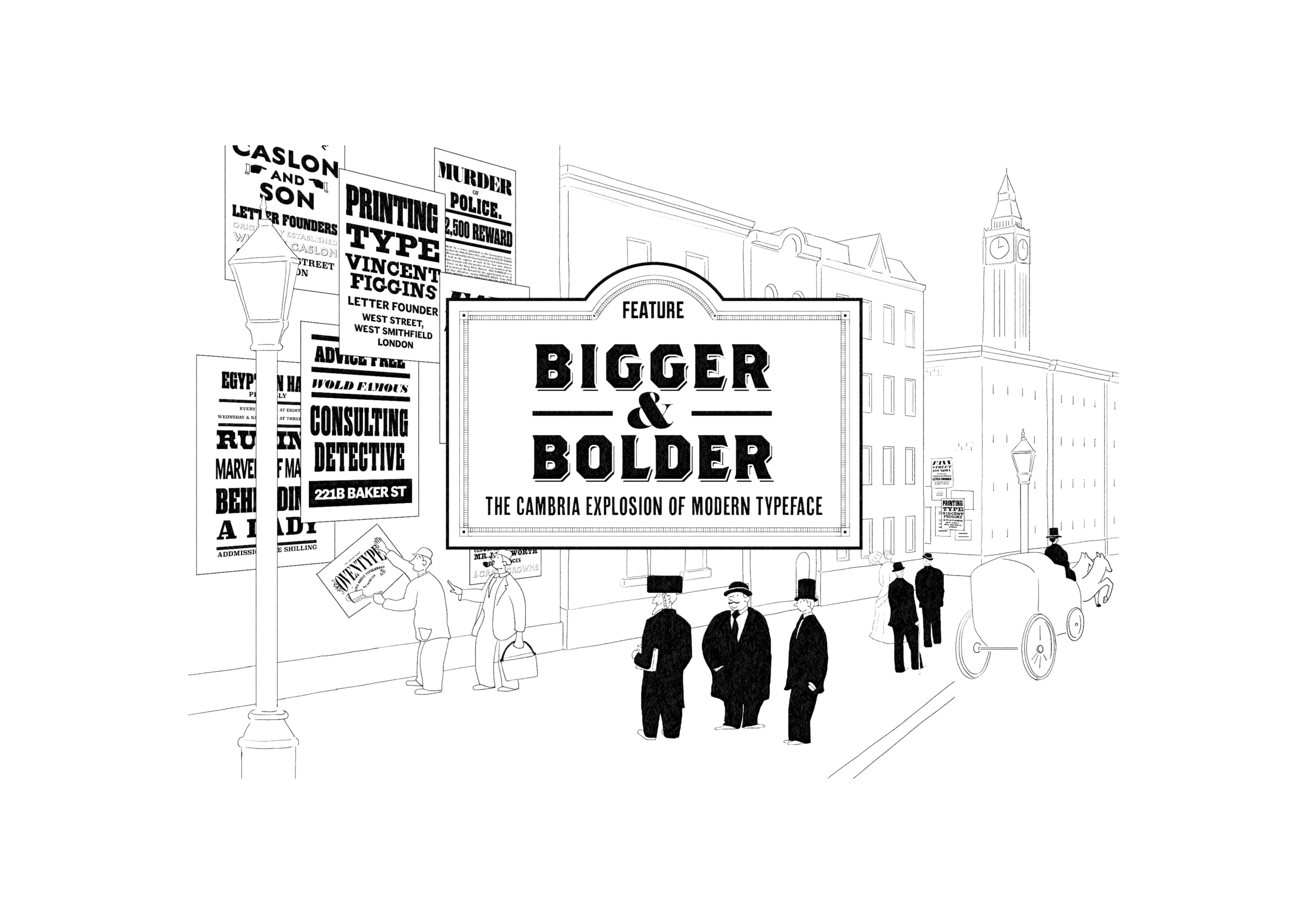
BIGGER&BOLDER VOL.1
The Cambria Explosion of Modern Typeface
ディスプレイタイプの誕生は革命的に文字のカタチを変えてしまった?より大きく、より太く「短い言葉」を読ませるための工夫は、粗々しく、そして時に美しく世界を彩ってきた。ファットフェイスからウッドタイプにいたるまで、19世紀の幕開けとともに誕生し歴史の影に埋もれたモダンタイプフェイスのカンブリア爆発をいま紐解く。
Did the birth of the display typeface revolutionize how letters look? The devices used to make bigger, bolder, “short words” readable have colored the world in rough and sometimes beautiful ways. From fat faces to woodcuts, we now unravel the Cambrian explosion of modern typefaces, born at the dawn of the 19th century and buried in the shadows of history.
Three Foundries in London
ロンドンの3つのファウンダリー
現在の豊富なタイプフェイスデザインの流れを遡ってゆくと枝分かれの結節点のような場所にたどりつきます。それは、文豪チャールズ・ディケンズが文章を書きはじめたころの19世紀初頭のロンドン。そこは産業革命の中心地でした。それは21世紀の現在にたとえるなら情報化時代のAppleやGoogleが集うシリコンバレーのような中心地で、そこでは「大きな活字」をつくることを目的にした3つの活字鋳造会社がありました。その時期の彼らの仕事は結果的に、その後の200年にわたって続くモダンタイプフェイスの原点をつくり、カンブリア爆発のようにタイプデザインの可能性を開花させた歴史的転換点となりました。今回はそんな活字の裏に隠れた活字づくりをめぐる人々の話です。
If we trace back the current abundance of type design, we find ourselves at a junction of branches. It was London in the early 19th century when the great writer Charles Dickens began to write. It was the center of the Industrial Revolution. It was a center like Silicon Valley in the 21st century, where Apple and Google gathered in the information age, and there were three type foundries whose purpose was to produce “large type”. Their work during this period led to the creation of modern typefaces that would last for the next 200 years, and was a historic turning point that unleashed the possibilities of type design like a Cambrian explosion. This issue is the story of the people behind the creation of these typefaces.
ポスターは最先端のメディアPoster were cutting-edge technology
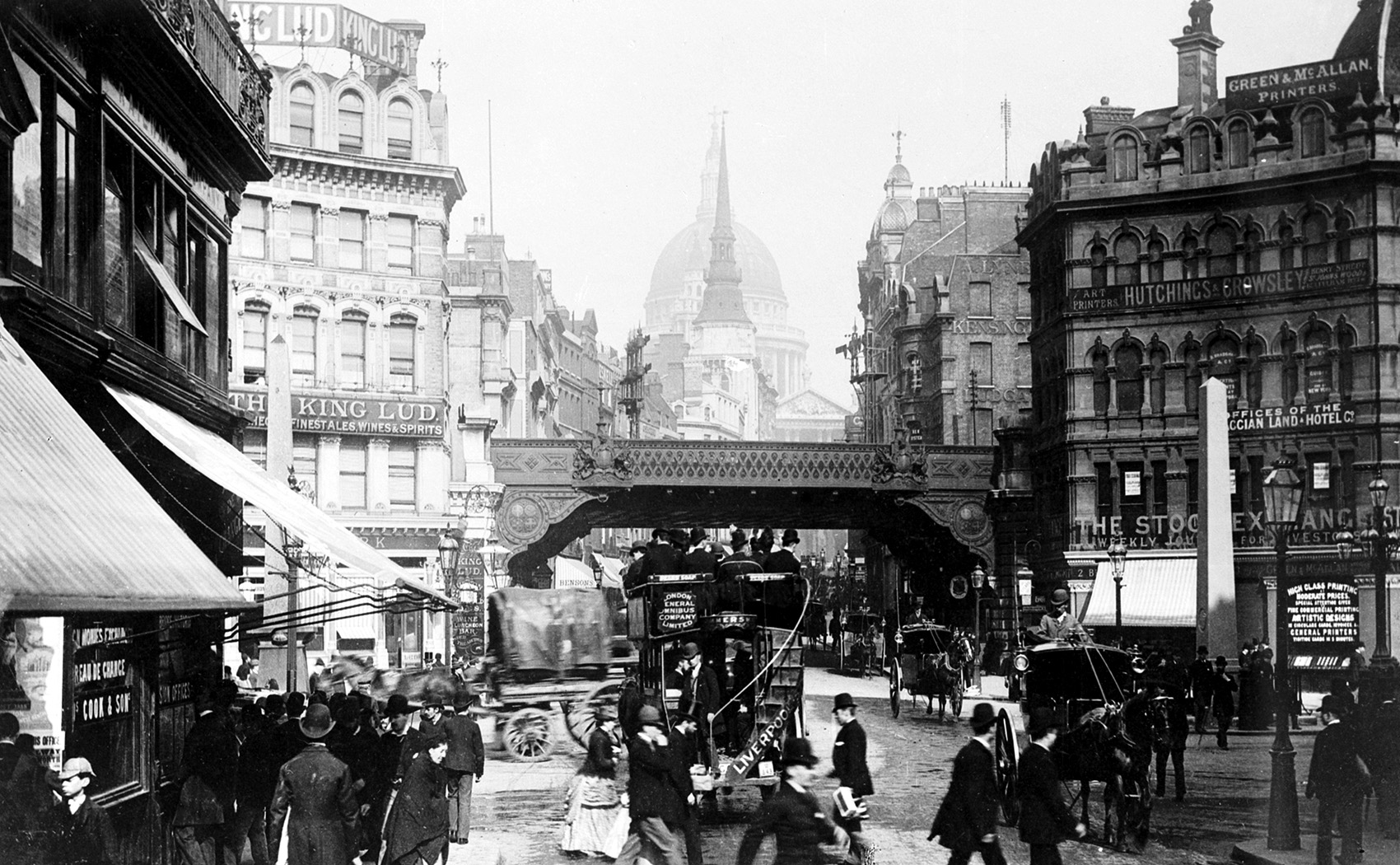
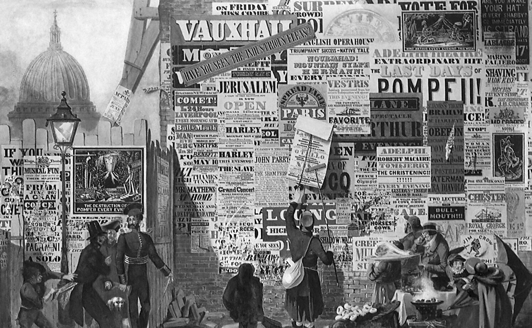
デジタルフォントを空気のように扱う世代にとっては、スクリーン上の文字は拡大も縮小も変形だって簡単にできてしまう。それが故に印刷に使う活字が金属の塊で重さがあり、その大きさを競うことが高度な技術の賜物だったことを考えるにはちょっとした補助線が必要になることとおもいます。すこし想像を広げてゆきましょう。今の当たり前も、それが存在しない時代にとってみては、驚異の未来技術以外の何物でもないことを考えてください。モノクロの液晶画面の携帯を使っていた人にとってiPhoneは最新技術の塊だったし、ラジオしかない時代には映像が映るテレビは驚きの技術だった。さらに時代をさかのぼると、肖像画を描く以外に自分の姿を残す方法がない時代に写真術は超高度な技術であっただろうし、手書きのお知らせが当然の時代に、街に何枚と複製を張り出すことができるポスターは最新のメディアだったのです。そう、19世紀の広告ポスターは最新のマスコミュニケーション手段で、印刷や文字を作る活字鋳造のファウンダリーは昨今のテック企業のような最先端の技術だったのです。産業革命によって誕生したマスマーケットや、そこで行われるヴィジュアルコミュニケーションのためのポスターの有用性が徐々に明らかになってきた段階でした。そして、あらたなメディアの需要を支えるために必須な最新技術の課題とは「大きな活字をつくる技術」だったのです。
For a generation that handles digital type as if it were air, it is easy to enlarge, shrink, and even transform letters on the screen. So it is necessary to take a step back and consider that the type used for printing was a heavy mass of metal, and the competition for size was the result of a highly developed technology.Let’s stretch our imaginations a bit. Consider that the things we take for granted today would have been nothing more than amazing future technology in a time when such things did not exist. For those who used cell phones with monochrome LCD screens, iPhones were the latest technology. Going further back in time, photography would have been a super advanced technology at a time when there was no way to preserve one’s image except by drawing portraits, and posters that could be reproduced as many times as possible and put up around town were the latest media at a time when handwritten notices were the norm. Yes, advertising posters in the 19th century were the latest means of mass communication, and the printing and type-casting foundries that produced the letters were cutting-edge technology, like today’s tech companies. At that time, the mass market created by the Industrial Revolution and the usefulness of posters for visual communication in that market were beginning to become apparent. And the last technological challenge that was essential to support the demand for new media was “the technology to make large print”.
大きなサイズの活字づくりProduction of larger type
今日でもローマンセリフ書体のスタンダードとなっている書体『CASLON』を生み出したキャスロン一世が興したキャスロンタイプファウンダリーが19世紀のはじまりまでロンドンの活字鋳造の中心企業でした。キャスロン一世が退いたのち息子のキャスロン二世がその後を継ぎ、彼の亡き後は未亡人とその義理の娘が後を継いだ典型的な一族経営の企業でした。18世紀の終盤ごろには、本文サイズよりも大きなサイズの活字づくりは始まっていましたが、サイズの大きな活字の製作は技術的に難しい部分が多く、その技術を唯一備えてたのはそのキャスロンタイプファウンダリーでした。そして、その時期に二人の重要人物がキャスロンタイプファウンダリーで働いていました。ジョセフ・ジャクソンJoseph Jackson (1733–1792)とトーマス・コッテレルThomas Cottrell(–1785)のふたりの人物。この二人は、本文書体の基本的な技術とともに、ポスターサイズの大きな活字の制作の技術を身につけた技術者でした。そしてのちに二人は独立してそれぞれが自身の新たなファウンダリーを設立することとなります。まだまだ本文書体が主体の18世紀の中頃に独立した二人のファウンダリーはそこそこの成功をおさめましたが、時の流れには抗えず引退後の後継者の問題を抱えていました。そして、この二つのファウンダリーの後継問題は印刷技術を深く知る者にとっては別の意味を持っていました。19世紀に差し掛かかった産業革命の好景気に湧くロンドンで印刷技術を深く知る者にとってポスターサイズの大きな活字の需要の高まりとそのビジネスの可能性は、インターネット黎明期の起業家のそれに似た万に一つのとてつもなく大きなチャンスとして映っていたことと思います。そして、わずかな数の者たちが、この二人のファウンダリーに眠っている技術の意味に気がついていました。
The Caslon Type Foundry, founded by Caslon I, the creator of the typeface CASLON, which is still the standard for Roman serif typefaces today, was the main type foundry in London until the beginning of the 19th century. After Caslon I retired, his son Caslon II succeeded him, and after his death, his widow and her daughter-in-law took over the business, which was a typical family business.Although the production of type larger than body size had begun by the end of the 18th century, it was the Caslon Type Foundry that was the only one equipped with the technology to produce the large type, which was technically difficult. Two important people were working at the Caslon Type Foundry during this period.Joseph Jackson (1733-1792) and Thomas Cottrell (-1785). These two men were technicians who had mastered the basic techniques of this typeface as well as the production of large poster-size type. Later, the two men became independent and established their own foundries. The two foundries were successful in the middle of the 18th century, when the main typeface was still used, but they were faced with the problem of finding successors after their retirement.For those who knew the art of printing in London during the boom years of the Industrial Revolution at the turn of the 19th century, the growing demand for poster-size type and its business potential were of great interest to them, The growing demand for large, poster-size type and its business potential was seen as a tremendous opportunity, similar to that of entrepreneurs in the early days of the Internet. And only a few realized the significance of the technology that lay dormant in these two foundries.
CASLON FOUNDRY
キャスロンファウンダリー
キャスロン三世とその息子キャスロン四世Caslon III and his son Caslon IV
後継問題を抱えるファウンダリに対して、まず最初に動いたのは、キャスロン3世でした。1792年ジョセフ・ジャクソンの死後売りに出されたファウンダリを買収してディスプレイタイプのビジネスに乗り出しました。業界トップの本家のビジネスは自身の母と弟の未亡人の二人の女性が経営権を握っていました。そのことに思うところがあったのか、はたまた向こう見ずな性格なのか、ファミリービジネスであった本家のキャスロンタイプファウンダリーの持分を金に変えて、自身の名前を据えた二つ目のキャスロンタイプファウンダリーをつくってしまいました。しかも、設立の翌年には破産しているという。しかし、なんとか立て直して経営を続け1807年に息子のキャスロン4世へ代替わりをはたしました。キャスロン4世はそんな親の姿を見てか誰よりも着実に仕事を進めてゆきます。1812年サンスペイリアマトリックスという新たな鋳造方法を発明します。これによって大きなサイズの活字の製作がより簡易に精巧になり生産に大きな変化をもたらしました。そして、1816年”TWO LINES ENGLISH EGYPTIAN” という名で世に出した新たなタイプフェイスデザインは初のサンセリフのタイプフェイスとなり後世へ名を刻むこととなります。その後、ファウンダリーは1819年に売りにだされスティーブンソンブレイク社(当時Blake, Garnett & Co. )に買収されました。本家のキャスロンファウンダリーも息子ヘンリーに代替わりを果たし19世紀後半から20世紀までディスプレイタイプを扱い手堅くビジネスを行なっています。そして、タイプ部門は1936年に同じくスティーブンソンブレイク社に買収されています。
The first to make a move against the succession problems of the foundries was Caslon III, who got into the display-type business by buying the foundry that had been put up for sale after Joseph Jackson’s death in 1792. The business of the main family, the industry leader, was controlled by two women, his mother and his brother’s widow. Whether it was his feelings about this or his daredevil nature, he converted his interest in the family business, Caslon Type Foundry, into gold and created a second Caslon Type Foundry with his name on it. Moreover, the year after its establishment, the company went bankrupt. However, he managed to recover and continued to run the business, and in 1807, he was succeeded by his son, Caslon IV. In 1812, he invented a new casting method called the Sanspirial Matrix, which enabled the production of large-size type. This made the production of large type easier and more elaborate, and brought about a major change in production. In 1816, a new typeface design was introduced under the name “TWO LINES ENGLISH EGYPTIAN,” which became the first sans serif typeface and was to become famous for generations to come.The foundry was sold in 1819 to the Stevenson-Blake Company (then Blake, Garnett & Co.). The original Caslon Foundry was replaced by his son Henry, who ran a solid business dealing in display type from the late 19th to the 20th century. The type division was acquired by Stevenson-Blake, also in 1936.
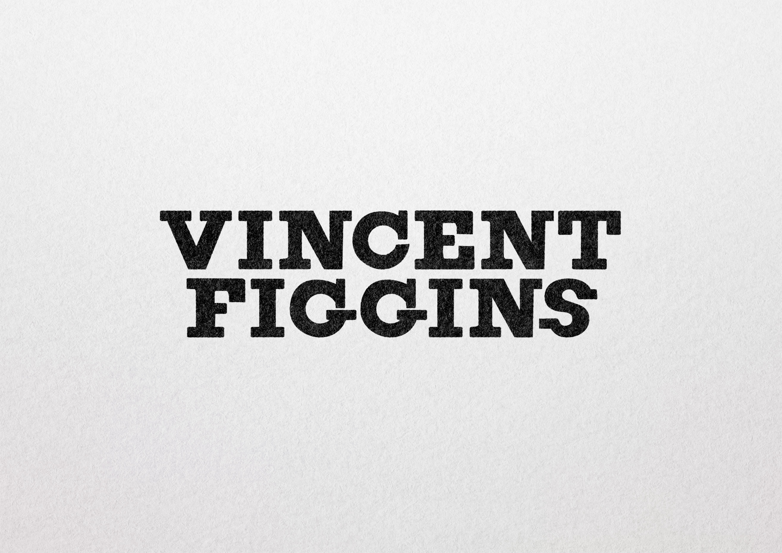
VINCENT FIGGINS
ヴィンセント・フィギンズ
技術力と商才を兼ね備えたフィギンズFiggins combines technical and commercial skills
後継問題を抱えていたジョセフ・ジャクソンの元で働き、技術が評価され主要な仕事を任されていた若いヴィンセント・フィギンズはジョセフのファウンダリを継ぐことを夢見ていました。子供のいなかったジョセフの死後ファウンダリが売り出されたのですが、一介の労働者だった26歳のヴィンセントにそのような資金はなく、キャスロン3世が金に物を言わせて奪い去ることを指をくわえて見ているしかありませんでした。しかしジョセフの顧客だった資本家の男の出資と後押しによって同じ年に自身のファウンダリーを立ち上げることとなります。そんな機会を逃さずチャレンジの場を与えられたフィギンズは、ディスプレイタイプフェイスの分野で才能を遺憾無く発揮し、多種多様なディスプレイフェイスをデザインして売り出していきました。1815年には初のスラブセリフである”ANTIQUE”を売出してその才能を世界にしらしめることとなります。またビジネスにも長け、ファットフェイスやサンセリフを初めて大きなマーケットに乗せ人気のタイプフェイスに導いてます。40年以上一線で活躍をつづけ1836年に息子に譲りリタイアしています。
Young Vincent Figgins, who had worked for Joseph Jackson, who was having succession problems, and who was given major responsibility for the business because of his skills, dreamed of taking over Joseph’s foundry. The foundry was put up for sale after Joseph’s childless death, but the 26-year-old Vincent, a laborer, had no such funds and had to watch as Caslon III took it away with his money. However, with the investment and encouragement of a capitalist man who was a client of Joseph’s, he was able to start his own foundry that same year.In 1815, he made his talent known to the world with his first slab serif, “ANTIQUE”. More over he was the first to take Fat Face and Sans Serif to the big market, leading them to become popular typefaces.After more than 40 years in the business, he passed the business on to his son, who retired in 1836.
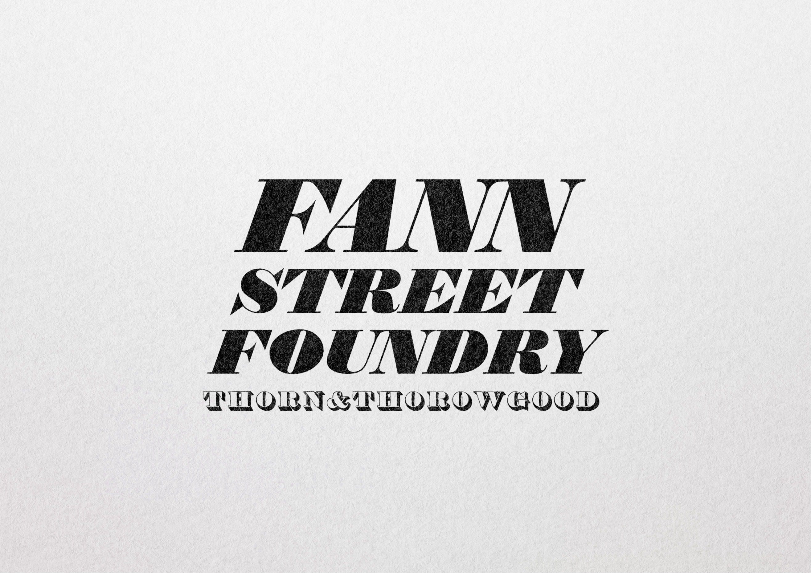
FANN STREET FOUNDRY
ファンストリートファウンダリー
名匠ソーンと幸運のソローグッドMaster Craftsman Thorn and Merchant Thorogood
後継問題を抱えたもう一人の重要人物トーマス・コッテレルの死後、彼のファウンダリーを買い取ったのは彼の元で技術を磨いていていた弟子のロバート・ソーンでした。ファンストリートに引越した後、ファンストリートファウンダリーと名前をあらためています。ソーンはファットフェイスの生みの親として知られ、1820年に亡くなるまでディスプレイタイプを手掛けてこのファウンダリを大成功に導き富を手にしています。ソーンの死後ファウンダリーはオークションにかけられ、それを手に入れたのはウィリアム・ソローグッドという男でした。ソーンのタイプづくりにおける実績と引き換え、ソローグッドは当初、活字づくりについてはまったくの素人でした。そもそもロトで当たったお金をもとにファウンダリーの経営に手を出したような野心だけのズブの素人だったのです。しかし、彼もタイプの歴史に多少の名を刻む事になります。”グロテスク”と呼んだ小文字とセットのサンセリフ書体やクラレンドンのリリースなどビジネス面で世界的な大ヒットを飛ばしファンストリートの名を世にしらしめました。1906年スティーブンソンブレイク社に買収されて幕を閉じています。
After the death of Thomas Cotterell, another important figure with succession problems, his foundry was purchased by Robert Thorn, an apprentice who had been developing his skills under him. After moving to Fan Street, the name was changed to Fann Street Foundry. Thorn is known as the creator of the fat face, a display type that made the foundry very successful and wealthy until his death in 1820. After his death, the foundry was auctioned off to a man named William Thorogood, who bought it. In contrast to Thorne’s achievements in type making, Thorogood was initially a complete beginner in the art of type making. He was an amateur with only the ambition of running a foundry with the money he had won in a lottery. But he, also, made a bit of a mark on the history of type. He made Fan Street’s name known with the release of thesans serif typeface and Clarendon, a set of lowercase letters he called “grotesque,” which became a worldwide business smash hit.In 1906, the company was purchased by Stevenson Blake & Co.
二つのファウンダリーの引き継ぎ問題に端を発して、業界トップ子孫のキャスロン親子、技術で名を挙げたフィギンズ、名匠からズブの素人に引き継がれたファンストリートファウンダリーの3つのファウンダリーがしのぎを削りあい、ディスプレイタイプひいてはモダンタイプの歴史が動きだします。そして、タイプフェイスデザインは僕らの時代に至るまであくなき進化をつづけてゆきます。19世紀当時にはまだ、現在のような著作権や意匠を保護するような仕組みが整っておらず、デザイン的な付加価値よりも、「大きな活字」としての価値、モノとしての価値に軸足がおかれいたことで、売れ筋や新たな文字の形はすぐさま模倣しあい3社がほぼ同じような品揃えで商売をしていました。なんの規制も入らない時代のデザインの競争は模倣の応酬のなかで増殖的に発生するとともに、産業革命真っ只中の純粋なマーケットに答える形でデザインが環境適応的に進化してゆくことで爆発的なスピードで多種多様なデザインが生まれることとなりました。それが、モダンタイプフェイスのカンブリア爆発とでも呼ぶべき現象を生み出しました。今回はそういった産業革命下のデザインの原点を整理することで、現代の豊富なタイプフェイスデザインの源流を探ってゆきます。
The problem of the succession of the two foundries led to a battle between three foundries: Caslon and his son, the descendants of the industry leaders, Figgins, who made a name for himself with his skills, and Funn Street Foundry, which was passed down from the masters to amateurs, and the modern type began to move forward. Typeface design continued to evolve relentlessly until our own time.In the 19th century, copyright and design protection systems were not yet in place as they are today, and the value of “large type” and “product” was more important than the added value of design. The competition for design in this unregulated era was extremely competitive.In an era of unregulated design competition, designs were multiplied through the exchange of imitations, and a wide variety of designs were created at an explosive pace as designs evolved in response to the pure market in the midst of the Industrial Revolution in an environmentally adaptive manner.This led to an explosion of a wide variety of designs, a phenomenon we might call the Cambrian explosion of modern typefaces.In this article, we will explore the origins of the abundance of modern typeface design by reviewing the origins of design during the Industrial Revolution.