The Another Face of Blackletter
Vol.04 Motorcycle Gangs
ブラックレターの裏の顔 —Vol.01 Motorcycle Gangs—
ブラックレターとモータサイクルギャングBlackletter and Motorcycle Gangs
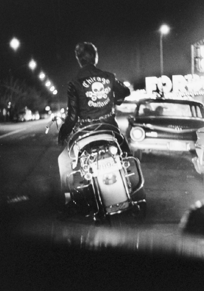
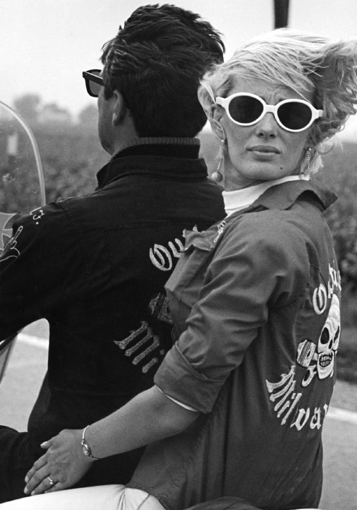
アメリカンポップカルチャーのアウトローの歴史はバイカーに遡ることができる。 第二次世界大戦後、アメリカが新たな平和の時代を進む中で大衆文化が限界を押し広げようと、新しい生き方の可能性を探す若者たちへ様々なアプローチをした。限界を超えたアウトローな生き方は強く若者たちを惹きつけ、ロックを中心にカウンターカルチャーが60年代に最盛期を迎えた。虚実がないまぜになってメディアによって拡散されるイメージがポップカルチャーをつくってゆく。その中で自由と反抗のシンボルとしてバイク乗り達がアウトローとしてアイコン化されていった。NYC編で70sのNYのストリートギャング達がファッションとして参考にしていたのが、そんなモーターサイクルギャング達のファッションだった。多くのモーターサイクルグループは、デニムジャケットやレザージャケットなどに、自分たちのクラブのロゴを背中に入れてグループのアイデンティティ築いた。そのロゴの書体にブラックレターが使われていることをしばしば見かけることができる。 1960年代に実際にシカゴのモーターサイクルクラブ「Outlaws」のメンバーとなり、彼らとともに旅をして、彼らのライフスタイルを伝えたニュージャーナリズムの写真家Danny Lyon による写真集『The Bikeriders』(1967)の中で、「Outlaws」のロゴにブラックレターを見ることができる。そのほかにも、鉄十字などナチス由来のシンボルなどが、バイカー達に好まれて使われていたことがここで確認できる。
The outlaw history of American pop culture can be traced back to bikers.After World War II, as America moved forward into a new era of peace, popular culture tried to push the limits and took various approaches to young people looking for possibilities for a new way of life. The outlaw way of life that transcended the limits strongly attracted young people, and the counterculture, centered on rock music, reached its peak in the 1960s. The images spread by the media, a mixture of truth and fiction, created pop culture. In this context, motorcyclists became iconic outlaws as symbols of freedom and rebellion, and it was the fashion of motorcycle gangs that the New York street gangs of the 70s referred to in the NYC episode. Many motorcycle groups built their identity on denim jackets and leather jackets with their club’s logo on the back. Often you can see black lettering used as the typeface of the logo.In “The Bikeriders” (1967), a book of photographs by Danny Lyon, a New Journalism photographer who actually became a member of the Outlaws motorcycle club in Chicago in the 1960s, traveled with them, and reported their lifestyle. The black letter can be seen in the logo of “Outlaws. Other symbols such as the Iron Cross and other Nazi-derived symbols were also favored by bikers, as can be check here.
ポップカルチャーとバイカーズPop Culture and Bikers
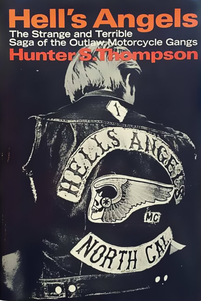
Gonzo ジャーナリストことハンター・S・トンプソンの『Hells Angels: The strange and Terrible saga』 (1967)が出版され,カウンターカルチャーとも関係の深かった、モーターサイクルギャングのHells Angelsのリアルなライフスタイルがノンフィクションとして描かれ多くの人の知るところとなったが、それ以前より、ジャンル映画として、低予算のエクスプロテーション映画としてのアウトローバイカーフィルムは人気が高かった。
The publication of Gonzo journalist Hunter S. Thompson’s “Hells Angels: The strange and Terrible saga” (1967), a nonfiction portrait of the real-life lifestyle of the Hells Angels motorcycle gang, which had close ties to the counterculture, made the book widely known. Even before that, outlaw biker films were popular as genre films and low-budget exploitation films.
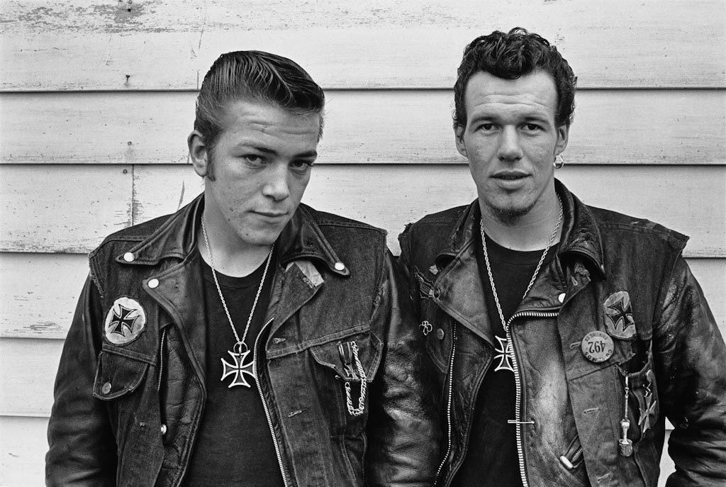
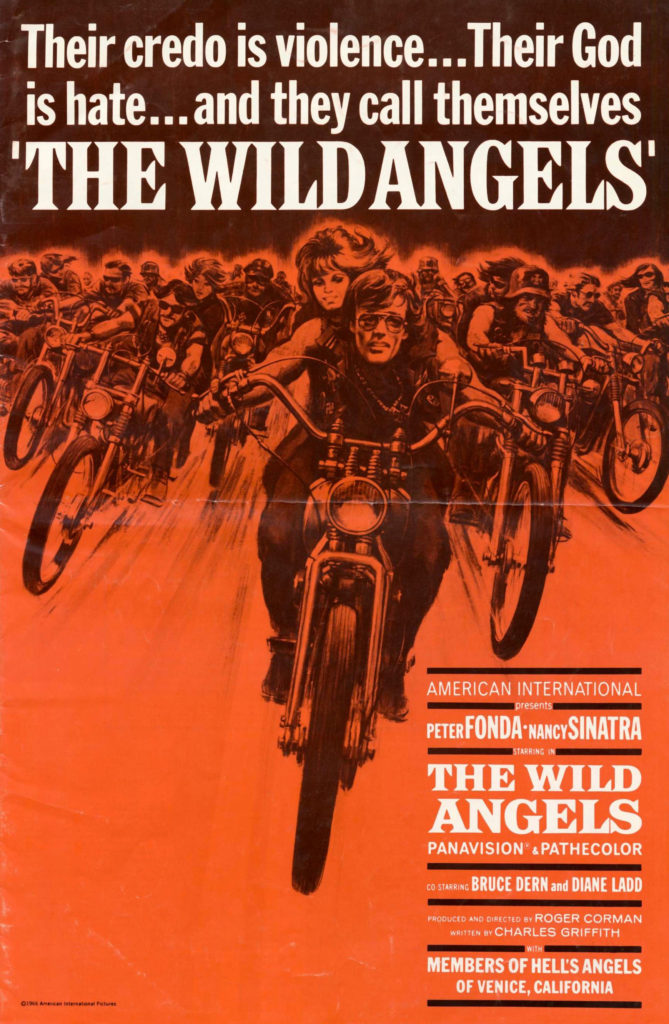
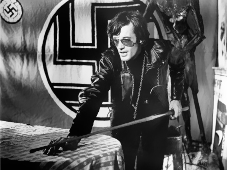
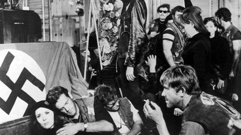
アウトローバイカーフィルムはマーロンブランドの映画『Wild one』(1953)で人気を博し広まり、 その成功をきっかけに低予算のB級映画が量産されバイクとアウトローイメージを誇張して扱うジャンル映画となっていった。多くは、ドライブインシアター向けの低予算の娯楽映画としてつくられ、アウトローイメージがカリカチュアライズされすぎて、今ではカルト映画となっているものもある。 その中には、 Peter Fonda主演のバイカーズムービーB級映画の帝王Roger Coen監督作品『The Wild Angels』(1966) では鉄十字を首からさげ、仲間の埋葬シーンではハーケンクロイツの旗で棺桶を包む。同じくコーマンプロデュースの『Devil’s Angels 』(1967) では、バイカー達はナチの装飾で飾られてアジトでパーティーを楽しむなどアウトローバイカーのイメージにはナチスのシンボルと固く結びつけられている。
Outlaw biker films became popular with Marlon Brando’s film “Wild one” (1953), The success of this film led to the mass production of low-budget B-movies, which became genre films with exaggerated images of motorcycles and outlaws. Many were made as low-budget entertainment films for drive-in theaters, and some have become cult films because of their overly caricatured outlaw image.Among them is “The Wild Angels” (1966), a biker movie starring Peter Fonda directed by Roger Coen, the king of B-movies, in which he wears an Iron Cross around his neck and wraps a coffin with a Harkenkreuz flag during the burial scene of his friends. In “Devil’s Angels” (1967), also produced by Coen, the image of outlaw bikers is firmly associated with Nazi symbols, as the bikers party at a hideout decorated with Nazi decorations.
なぜバイカーとナチスのシンボルが好きなのかWhy do bikers like Nazi symbols?
あるウェブフォーラムで「なぜバイカーはナチのヘルメットを好んでかぶるのか?」という問いに対して、ある人が、「戦後、帰還兵がナチを倒した武勇伝の証拠としてナチヘルを土産がわりに持ちかえり自身の勇敢さを見せつけたことからバイカー達に定着していった」と答えていた。なるほど。そのほかのシンボルも同様に、ナチスもを恐れない態度または、ナチスと同等の恐怖の存在、的な表現をすることで定着していったのではないかと考えられる。戦後のアメリカでは、メディアのなかで、徹底的にナチス=悪 の図式で描かれることが多く、アウトローの目線に立たなければナチス的なものを肯定的にとらえることは常識的に考えられないだろう。裏返せば、ナチスを肯定的にとらえることで、アウトローであることを表明できるゆえ、ナチスのシンボルを使うことになっていったのだろう。そして、B級映画の中でさらにカリカチュアライズされた、ステレオタイプとしてバイカーのイメージが出来上がっていった。いずれにせよ、バイカー達が好んで、ナチスのシンボルを使っていることは事実であり、アメリカのアウトローカルチャーの中に定着したブラックレターはナチス由来のものである可能性はとても高いと思われる。
On a web forum, someone asked, “Why do bikers like to wear Nazi helmets?” One person responded, “After the war, returning soldiers took Nazi helmets as souvenirs to show their bravery in defeating the Nazis, and it became a common symbol among bikers. I see. Other symbols may have taken root in the same way, by expressing a fearless attitude toward the Nazis, or by expressing a fear of the Nazis on an equal level with them. In postwar America, the media often depicted Nazis as evil, and it would be unthinkable to view Nazism in a positive way without standing in the perspective of an outlaw. On the other hand, by viewing the Nazis in a positive way, one can express oneself as an outlaw, which is why the Nazi symbols were used in the films.The image of the biker was further caricatured as a stereotype in B-movies. In any case, it is a fact that bikers like to use Nazi symbols, and it is very likely that the black letter that has taken root in the American out-local culture is of Nazi origin.
ブラックレターとナチスThe Black Letter and the Nazis
ナチスが行なってきたことの悪行の数々は歴史を調べればとても詳しく知ることが出来るので、ここでは、シンプルにブラックレターとナチスの関係について絞って考えてみたい。 ドイツ語圏では長いあいだブラックレターが母国語の基本的な活字として使われてきた歴史がある。 もともと中世では西ヨーロッパ各地でブラックレターが使われていた。主にカソリック教会の写本などの用途としてつかわれ、15世紀に初めての活版印刷『グーテンベルグの42行聖書』も、テクストゥールというブレックレターの活字で印刷されている。15世紀以降、ルネッサンスの影響で、活字がブラックレターからラテン・ローマン体に他の国が移行してゆくなかで、ドイツ国内では、Schwabacherシュヴァーバッハという、丸みがかったブラックレターを使い続けていた。宗教改革の『ルターの聖書』などで使われたのもこの書体。 その後、16世紀からFrakturフラクトゥールという書体が主流となった。フラクトゥールは16世紀に 木版画『Triumphal Arch(凱旋門)』のためにデザインされ、初めてのドイツ語のためのみにつくられたブラックレターとなり。以降20世紀までドイツ国内でつかわれてゆくことになった。ドイツ国内では、「アンティカ・フラクトゥール論争」という、ローマン体とブラックレターのどちらが優れているかという論争が19世紀よりつづいており、1941年にナチスがフラクトゥール体の元となったシュヴァーバッハ体はユダヤ人に起源を持つという理由で シュヴァーバッハ体を使用禁止したことにより、この論争に決着がつき以降アンティカ体が推奨された。理由としては、ヨーロッパ各地を占領したナチスにとって、現地人が読めないことやブラックレターの活字がない現地の印刷機を使うことが妨げになったためと考えられている。
Since the many evil acts of the Nazis can be learned in great detail by studying their history, we would like to focus simply on the relationship between the black letter and the Nazis.In German-speaking countries, blackletter has a long history of being used as the basic type of the native language.Blackletter was originally used throughout Western Europe in the Middle Ages. The first letterpress printing of the 15th century, “Gutenberg’s 42-line Bible,” was printed using textured blackletter type.While the rest of the world shifted from blackletter to Latin Roman type after the Renaissance, Germany continued to use the rounded blackletter type called Schwabacher . This typeface was also used in Luther’s Bible and other works of the Reformation.Later, from the 16th century, the typeface Fraktur became the predominant typeface. Fraktur was designed for the woodcut Triumphal Arch in the 16th century and was the first blackletter to be made exclusively for the German language. It remained in use in Germany until the 20th century.In Germany, the “Antica-Fructal Controversy,” a dispute over the superiority of Roman or black lettering, had been going on since the 19th century, and in 1941 the Nazis banned the use of the Schwabach In 1941, the Nazis banned the use of the Schwabach type on the grounds that it was of Jewish origin, thus settling the controversy, and thereafter the Antica type was recommended. The reason is believed to have been that the Nazis, who occupied many parts of Europe, were prevented from using local printing presses that could not be read by the locals and that did not have blackletter type.

ナチス時代特有のブラックレターblackletter in the Nazi regime in Germany
ナチス・ドイツ政権下の時代、Gebrochene Grotesk(サンセリフのブラックレター)と呼ばれる、フラクトゥールをサンセリフのように簡素化した書体が積極的に使われていた。代表的な書体にTannenbergなどがある。1910年代から30年代にかけてデザインされ、ナチスが台頭した30年代にポスターやチラシの見出し書体や、看板などによく使われており、戦中の短い期間だけ使われていたことで、「軍隊靴サンセリフ」という別名で呼ばれている。 Just Another Blog:ナチスと書体について
ring the Nazi regime in Germany, a typeface called Gebrochene Grotesk (sans-serif blackletter), a simplified version of Fraktur that looks like a sans-serif, was actively used. Typical typefaces include Tannenberg, which was designed between the 1910s and 1930s and was often used as a headline typeface for posters and flyers and on signs during the Nazi rise to power in the 1930s, and was also known as “military shoe sans serif” because it was used only briefly during the war.


ナチスのシンボルNazi Symbols
タイプフェイスとは違うが、ロゴやシンボルは言葉と同様またはそれ以上に機能する場合がある。 ナチスで使用されていたシンボルはその歴史から、現在ドイツをはじめ公共の場所での使用を禁止されている国が多数あります。 文字形自体は内容を含まず言葉の意味が重視されるが、シンボルは付随している意味を直接象徴することになるのでその利用を禁止するという対策がとられています。もし、以下のシンボルが象徴するものがわからないのであれば必ず調べて歴史を知ってください。類似のイメージはポップカルチャーの中で敵役や帝国主義的なイメージを示す際に多数つかわれていますが、ポップカルチャーで上書きされたイメージで扱うことがいかに危険か理解できると思います。
Although not the same as typefaces, logos and symbols may function as well or better than words. Because of their history, the symbols used by the Nazis are now banned in Germany and many other countries from being used in public places. While the letter form itself does not contain content and the emphasis is on the meaning of the words, symbols directly symbolize the meaning they accompany, so measures have been taken to prohibit their use. If you are not sure what the following symbols symbolize, be sure to look them up and learn about their history. Similar images are used in pop culture to represent antagonists and imperialistic imagery in many cases, but you can see how dangerous it can be to deal with images that have been overwritten by pop culture.
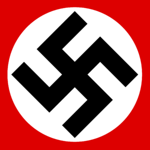
ハーケンクロイツHakenkreuz.
45度に傾けられた鉤十字。ナチス・ドイツの国旗に使用された。
A swastika tilted at 45 degrees. Used on the flag of Nazi Germany.
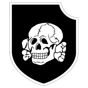
トーテンコップTotenkopf
ドクロを使った武装親衛隊SSの紋章。第3SS装甲師団の師団章。
Emblem of the armed SS with a skull. Divisional emblem of the 3rd SS Armored Division.
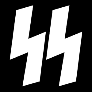
ナチス親衛隊SS
ナチス親衛隊(SS)のマーク。古代ゲルマンのルーン文字を意匠化。
Mark of the Nazi SS, commonly known as the SS. Design of ancient Germanic runes.

鉄十字Iron Cross
先端に向かって広がる十字。勲章として用いられた。
A cross that widens toward the tip. It was used as a decoration.
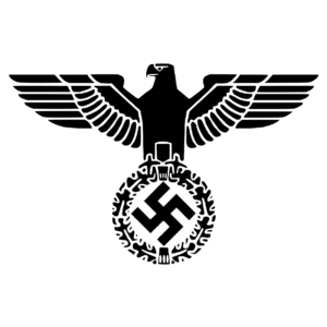
アドラー・鷲Adler eagle
鉤十字の上に鷲をあしらった、ナチス・ドイツの国章。
National emblem of Nazi Germany with an eagle above the swastika.
白人至上主義とナチスWhite Supremacy and Nazis
バイカーギャングなどともクロスすることなのだけれど、昨今、アメリカのメディアで取り上げられ、再燃しているネオナチや白人至上主義団体のナチズムのシンボル利用は、ポップカルチャーの中に出てくるカリカチュアライズされ無害化されたシンボルのようにも、元の意味に近い意味で使われるようにもみえる。露悪的な趣味の表出で片付けてしまいたい気持ちもあるが、リアリティーショーの様にメディアを利用する大統領が進む道が独裁国家なのではないかと本気で疑いたくもなる。 メディアは社会を鏡の様にうつしつつ、そして脚色も施す。虚実がないまぜになって時代を作ってゆく。グラフィックデザインやTV番組は、カリアチュアライズされたステレオタイプとして記号を操るうちに本来的な意味から離れてゆくイメージたちのことをもう少し真剣に考えてみてもいいように思う。ポストトゥルースの時代には、アンチヒーローとヒーローの境目が消えかけているように思える。
The use of symbols of Nazism by neo-Nazis and white supremacist groups, which has recently been picked up and revived in the American media, can be seen as a caricatured and detoxified symbol in pop culture, or it can be used in a way that is close to its original meaning. It also appears to be used in a way that is close to its original meaning. While it is tempting to dismiss the use of nazism as a manifestation of a devious taste, one seriously wonders if the path taken by a president who uses the media like a reality show is that of a dictatorship. The media is like a mirror of society, but it is also a dramatization of the times. Graphic design and TV programs could seriously consider the images that are becoming more and more distanced from their original meanings as they manipulate symbols as caryatrized stereotypes. In the post-truth era, the boundary between anti-hero and hero seems to be disappearing.
最後にFinally
ブラックレターの持つ、太いステムと角張ったシェイプは男性的で屈強なイメージを連想させ、揺るぎのない意志を感じさせる。一方で、しなやかさや装飾性をも兼ね備え崇高なイメージも共に持ち合わせている。そういったかたちが本来持つイメージが、文化的な文脈と組み合わせることでもうひとつの特別な意味が立ち上がり、それが、時代とともに受け継がれ移り変わってゆく。 タイプの話題はたいてい大昔のことが多いから、生きたタイプを扱うためにもひとつの個人的な疑問から出発して、タイプを中心にして最近の文化や社会を見回してみるということからはじめてみた。100年近くの1つの文字の形についたもうひとつのイメージを探る旅で計らずも現代文化の反抗の表現の歴史をたどることになったことは、とても面白く考えさせられる経験だったように思える。同時多発的に起こる表層のイメージは、ひとつの流れにまとめきれるものではないが時代を通すことで、なんらかの全体像は見えてきたのではないだろうか。
The thick stem and angular shape of black lettering evoke an image of masculine strength and unshakable will. On the other hand, it also has a sublime image that is both supple and decorative. When combined with the cultural context, these original images take on another special meaning, which is passed on and changed with the times. Since most of the topics of type are ancient, in order to deal with living type, I started with a personal question and began by looking around recent culture and society with type at the center of my research. It has been an interesting and thought-provoking experience to trace the history of the expression of cultural rebellion. The “things” cannot be organized into a single trend, but by looking through the ages, we may be able to get some kind of overall picture.