
Futurama Opening Title
07/30/2018
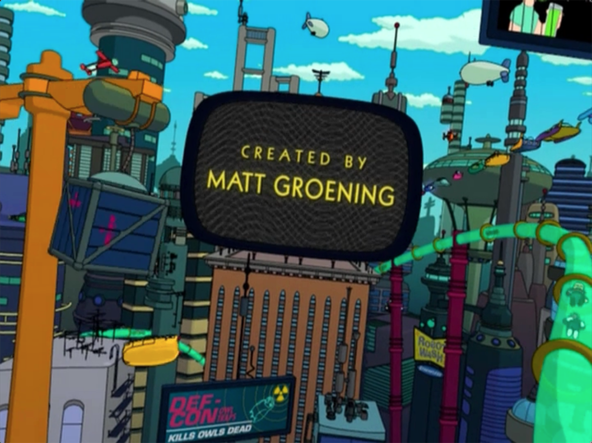
シンプソンズのMatt Groeningによるアニメーション。31世紀を舞台に繰り広げられるアメリカンなブラックユーモアたっぷりの心温まる大人向けのアニメーションシットコム。タイトルにもあるFUTURAMAとは1939年の NY万博のパビリオンに由来していて、当時の未来像を表す最新のキャチフレーズとして使われていました。オプティミスティックなSF的な未来像とその後の現実はかけ離れてしまい、そこへの慕情として皮肉いっぱいに使われています。使われているフォントはITC KableとInsignia。どちらも30年アール・デコのイメージを持つタイプフェイスで、NY万博の時代を想起させつつ、幾何学的な単純さのあるポップな形体はこのアニメーションの他のパーツとの相性もよくとてもよい演出として使われています。
Created by Simpsons creator Matt Groening, this heartwarming animated sitcom for adults is set in the 31st century and is full of American black humor. The title, Futurama, comes from the pavilion at the 1939 New York World's Fair, and was the latest catchphrase to describe the vision of the future at the time. The optimistic science fiction vision of the future and the reality that followed were so far apart that it was used ironically as a sentiment of worship for the future. The fonts used are ITC Kable and Insignia, both of which have a 30's art deco feel reminiscent of the New York World's Fair, but with a geometric simplicity and pop style that works well with the other parts of this animation.
-
Typeface


-
Format
Film/Video -
Industries
Film/TV -
Designer
Matt Groening -
Location
United States -
Publish Date
1999
Typeface
Kable は1927年にリリースされたジオメトリックサンセリフのタイプフェイスです。オリジナルはRudolf KochのデザインでドイツのKlingspor foundryからリリースされた活字です。Kabel は初の大西洋に渡したテレフォンケーブルへの記念してつけられました。1975年Stempel社の特別なライセンスのもと、the International Typeface Corporation ITCが5つのウェイトを足したフォントファミリーを再設計しました。 人間味のある線と幾何学的なプロポーションの組み合わせはこのサンセリフを特徴づけてます。
Designed by Rudolf Koch and released in 1927 by the Klingspor foundry in Germany, Kabel is named in honor of the laying of the first trans-Atlantic telephone cable. In 1975, under special license from D. Stempel AG, the International Typeface Corporation redrew the family and added a fifth weight. Geometric proportions are combined with humanistic features in this unusual sans serif typeface.
Insigniaは1968年にリリースされたサンセリフのタイプフェイスです。イギリスのデザイナーNeville Brodyによるデザインで、オリジナルの開発はArena magazineのためのヘッドラインのフォントとしてはじまりました。Insigniaはモノラインのディスプレイタイプフェイスで、大文字のメインのストロークと交差する線が突き抜けてはみ出す特徴的なデザインをしています。この視認性の高いデザインのフォントは、広告やディスプレイなどに向いています。
Insignia is a 1986 typeface by British designer Neville Brody. Originally developed as a headline face for Arena magazine, Insignia is a monoline display typeface immediately identifiable by cross-strokes on the capitals that cut through the main stems of the capital letters. Use Insignia for advertising and display work.


