
The Flower shop
07/30/2018
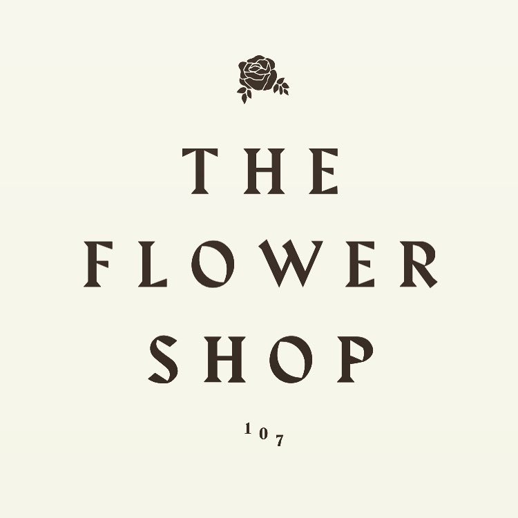
NYCのレストラン&バー。70年代のおばあちゃん家のハウスパーティーみたいなくつろいだレトロな空間が今時のクールなんだとは、都会人の遊び心はひねりの効いてて面白い。店のサインに使われているフォントは、Harbour。70年代のクラブハウスのサインのようなイメージもありつつ、ルーズなレタースペースで現代的なクールさも持たせている。
A restaurant and bar in New York City, where a laid-back retro space that looks like a house party at grandma's house in the 70s is the cool thing to do these days. The font used for the sign is Harbour, which has the look of a 70's clubhouse sign, but with a loose letter spacing that gives it a modern coolness.


-
Typeface

-
Format
Signs -
Industries
Food/Beverage -
Designer
Studio Paradise -
Location
United States -
Publish Date
2017
Typeface
Harbourはブラックレター風のディスプレイ用のセリフタイプフェイスです。Harbour はラテンとゲルマニックのスタイル-文化的に政治的にそして美的に対立する2つのレターフォーム–のぶつかりあいです。ラテンタイプフェイスのレターフォームは幾何学が基本ですがブラックレターはカリグラフィーが基本です。Harbourはペン由来のカリグラフィックな形を生かしつつタイプフェイス自体はペンで書かれた文字というよりも活字として明確に設計されたダイナミックなレターフォームとして制作されています。
Harbour is a clash of Latin and Germanic typestyles - two conflicting letterforms, culturally, politically and aesthetically. Latin letterforms have a geometric base, blackletter types are calligraphic. Harbour takes calligraphic forms that derive from writing with quills, but is a typeface that is clearly drawn‚ rather than written‚ to produce graphic, dynamic letterforms.


