
Mast Brothers
07/30/2018
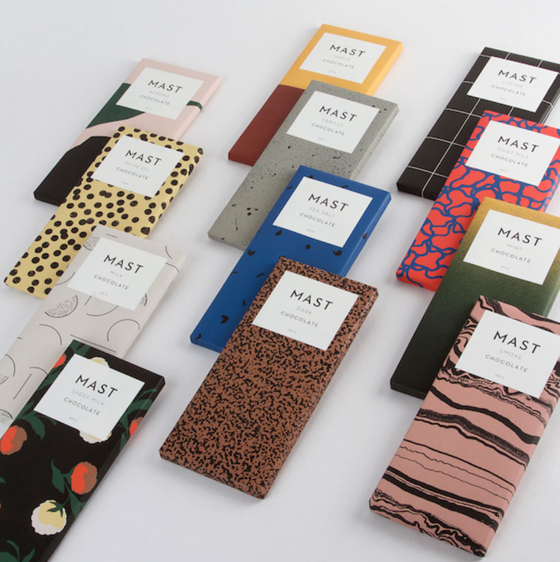
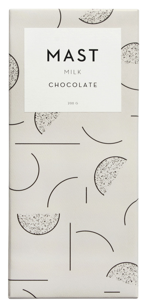
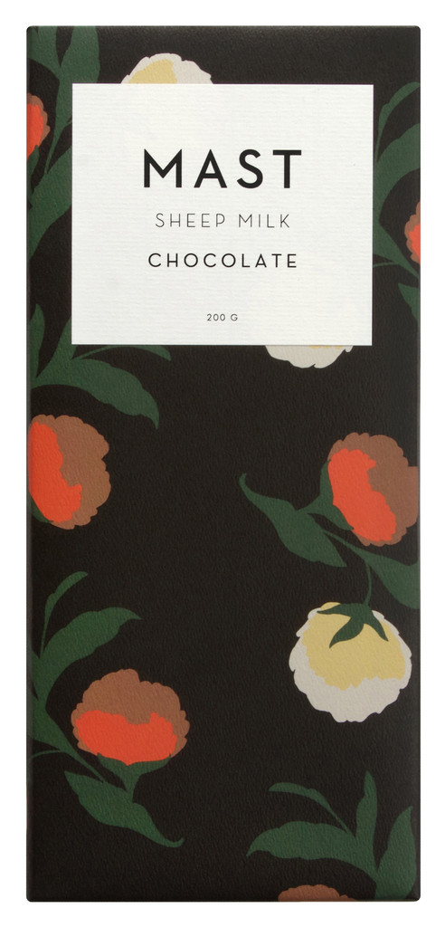
NYCのbean to bar の先駆けチョコレートブランド。イタリアのROSSI社の包装紙をつかったパッケージデザインが秀逸で、ブランドロゴに使われているフォントはNeutraface. NYCというお土地柄とチョコレートという素材が合間ってアールデコを想起させる文字を選ぶのは必然だったのかも。 ミニマルかつデコラティブという難しい組み合わせをうまく両立させた素晴らしいパッケージデザイン。
A pioneering bean-to-bar chocolate brand in New York City.The packaging design using Italian ROSSI wrapping paper is superb, and the font used for the brand logo is Neutraface. The packaging design is a wonderful example of how well the difficult combination of minimalist style and decorative style can be achieved.
-
Typeface

-
Format
Packages -
Industries
Food/Beverage -
Designer
Nathan Warkentin -
Location
United States -
Publish Date
Typeface
Neutrafaceは2002年にリリースされたジオメトリックサンセリフのタイプフェイスです。House IndustriesのChristian Schwartzによってデザインされました。Richard Neutraの建築からの影響を受けており、タイプフェイスの開発にあたっては、息子とパートナーだったDion Neutraが関わっています。ディスプレイ用フォントは7つウェイト・スタイル、本文用フォントは8つのウェイト・スタイルをもつフォントファミリーです。
Neutraface is a geometric sans-serif typeface designed by Christian Schwartz for House Industries, an American digital type foundry. It was influenced by the work of architect Richard Neutra and was developed with the assistance of Neutra's son and former partner, Dion Neutra.


